They can be fucking annoying. Like we get it, you sit down and think you're somehow superior for being different. Otherwise I take no issue with them.
nimpnin
joined 1 year ago
Greetings from Sweden, here shared washing machines are really common and generally not disguisting at all.
There are also solutions to people behaving badly in apartment buildings. Unfortunate if nothing was done at yours, but it’s definitely not an impossible problem to solve.
Wouldn't it be just a lot easier to prevent them from selling it in the first place
Microblogging is definitely useful for many things, short and quick thoughts, links to news articles, jokes, memes etc. You can also comment and share things easily. Microblogging actually resembles instant messaging in a lot of ways, just with an undefined ’group chat’ size.
I find it kinda funny that Twitter has become so toxic that people start thinking there must be something wrong with the format.
Also RSS clearly can’t replicate a big chunk of the desirable properties of microblogging (eg. easy sharing and commenting).
What's the point of using 2FA on non-crucial accounts anyway? If somebody wants to hack my lemmy account or something, I don't really care at the end of the day.
Oh so they are not new users coming in? Well that paints a pretty different picture then
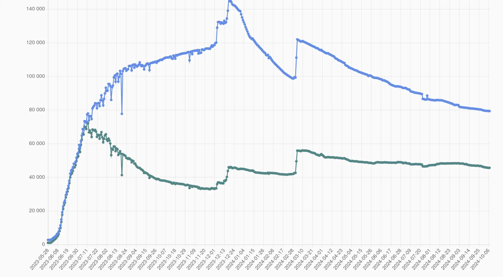
You talk as if you don’t understand how plots work. If the change looks like a 90% drop, that’s how it’s going to be perceived.
Moreover, if you do start from 0 you instinctively see the 5% drop, and can make the conclusion that it’s big or small yourself. If you don’t do that, you need to calculate numbers. People don’t do that. They see line go down, and get the impression from that.
Any drop would look the same on the initial plot. 5%, drop 50% drop, 0.005% drop. The ’start your y axis at 0’ rule has a lot of exeptions, but this is not one of them. In fact, it’s the quintessential example of lying with a plot.
If you want to see the actual values for each timestep, there are better tools for that. Such as a table.
Explaining all of this feels bizarre. You are de facto trolling by this weird contrarianism.
If you start at 0, you see exactly what you're supposed to: there is a rather negligible trend in the given timeframe.
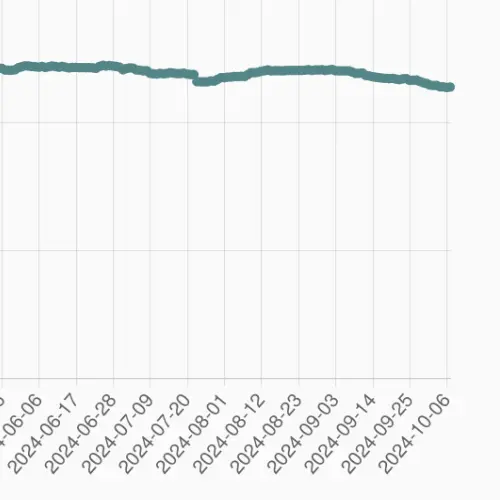
That's the point. The number of users has very slightly declined in the past few months. Under the original plot, you have a lot of people (rightly) misinterpreting the data, and saying that a lot of users are leaving the site.
That's why you start at 0. So that people interpret the data correctly.
Let's put that to a test
The same plot with a more reasonable y-axis:

Active users (monthly is what you should be looking at) is very slowly declining, however we are still above the level that we were before the most recent influx.
Wii, PS3 and Xbox 360 becoming retro consoles