Zeus

joined 2 years ago
MODERATOR OF
[–] Zeus@lemm.ee -1 points 2 years ago* (last edited 2 years ago)

i honestly don't know

i feel like it's not …"chalky" enough? but it could be, because it does have that richness

[–] Zeus@lemm.ee 0 points 2 years ago* (last edited 2 years ago)

i'm firmly of the belief that it's designed to be on the left

if you use a calculator with your left hand, A) your thumb (strongest digit) rests on = (most used button), and B) you can write with your right hand

then some wacko put it on the right of the keyboard, so enter is on your little finger and the mouse is miles away[^1] and now we have to live with the consequences

[^1]: yes i realise mouses weren't around when this layout was designed

[–] Zeus@lemm.ee 6 points 2 years ago* (last edited 2 years ago) (1 children)

in about:config, try removing the pertinent domains from extensions.webextensions.restrictedDomains

i've never done this though, so caveat executor

[–] Zeus@lemm.ee 17 points 2 years ago

holy hell this is massive

thank you for your work db0

[–] Zeus@lemm.ee 3 points 2 years ago

commiserations, and kudos for doing all you've done so far to try to keep it running

[–] Zeus@lemm.ee -1 points 2 years ago* (last edited 2 years ago) (3 children)

ah. now. this is an interesting conversation

generally i try my best with accessibility; but recently i have been slacking with alt text in this lemmysphere[^1] specifically. my thinking is that this i visual-focussed art appreciation 'sphere, so the vast minority (i hesitate to speak in absolutes, but i could say none) of the subscribers will be blind or even partially sighted

i am fully in favour of transcriptions of text screenshots and images with semantic meaning, but this is solely an æsthetic piece?

do you, or does anyone affected by this, have any opinions on whether this is worth it here?

(very atmospheric transcription though)


edit: more questions:

  1. why do you have multiple 'spheres (!mmtranscriptarchive@lemmy.world, !kebtranscriparchive@lemmy.blahaj.zone) rather than one centralised one? - especially as lemmy doesn't support instance agnostic post links, and your links are therefore inconsistent and off-instance

  2. how did you find this post? do you just browse by new?

  3. to anyone who uses a screen reader - is there any advantage to a separate transcription if there is one in the alt text?

[^1]: and the other f.n.i.c. 'spheres

[–] Zeus@lemm.ee 1 points 2 years ago* (last edited 2 years ago) (1 children)

post urls seem to be completely randomly uncorrelated - https://lemm.ee/post/1 is unrelated to https://lemmy.world/post/1

but yes, there should be some way to easily redirect - i believe that is what #2987 is supposed to solve


i don't think old urls would have to be repaired, they could just be treated as a shortlink/server-side redirect

for example, reddit supports https://www.reddit.com/r/androidthemes/comments/uvy0nx/contest_macintosh_rejuvenated/ and https://redd.it/uvy0nx - the latter just redirects to the former

[–] Zeus@lemm.ee 1 points 2 years ago (1 children)

i don't believe it can be deletion, i'm guessing they never existed - i imagine it's some sort of batch assignment to avoid url collisions due to server lag

but that's all beyond me, so this is just conjecture

by the way, do you just open lemmy.world/post/[some round number] and increment until you find a post that exists?

[–] Zeus@lemm.ee 1 points 2 years ago (6 children)

i must say, i don't understand lemmy's url system

i can't believe 37 sequential posts were deleted? also, on it's only the ~360'000^th^ post on lemm.ee? and it should be roughly equal i would have thought?

i wish they used a sensible and legible url scheme like reddit (amongst other issues i have with lemmy urls)

[–] Zeus@lemm.ee 2 points 2 years ago* (last edited 2 years ago)

honestly, i think both of these rather seem like non-issues?

free hosting is not immune to hugs of death

neither is self-hosting; if anything, less so

deploy times are increased

yes, a 3min -> 15min deploy time is a surprising difference; but also 15 minutes is not that long. especially as that's because it's building the Jekyll site. if you include the local build time as well as upload time, i don't imagine it'd be that much shorter

maybe if you're trading stocks, but for small personal sites? it doesn't sound too bad

[–] Zeus@lemm.ee 3 points 2 years ago

jerboa supports it! press the little exclamation mark in a diamond (it's a triangle on desktop for anyone wondering)


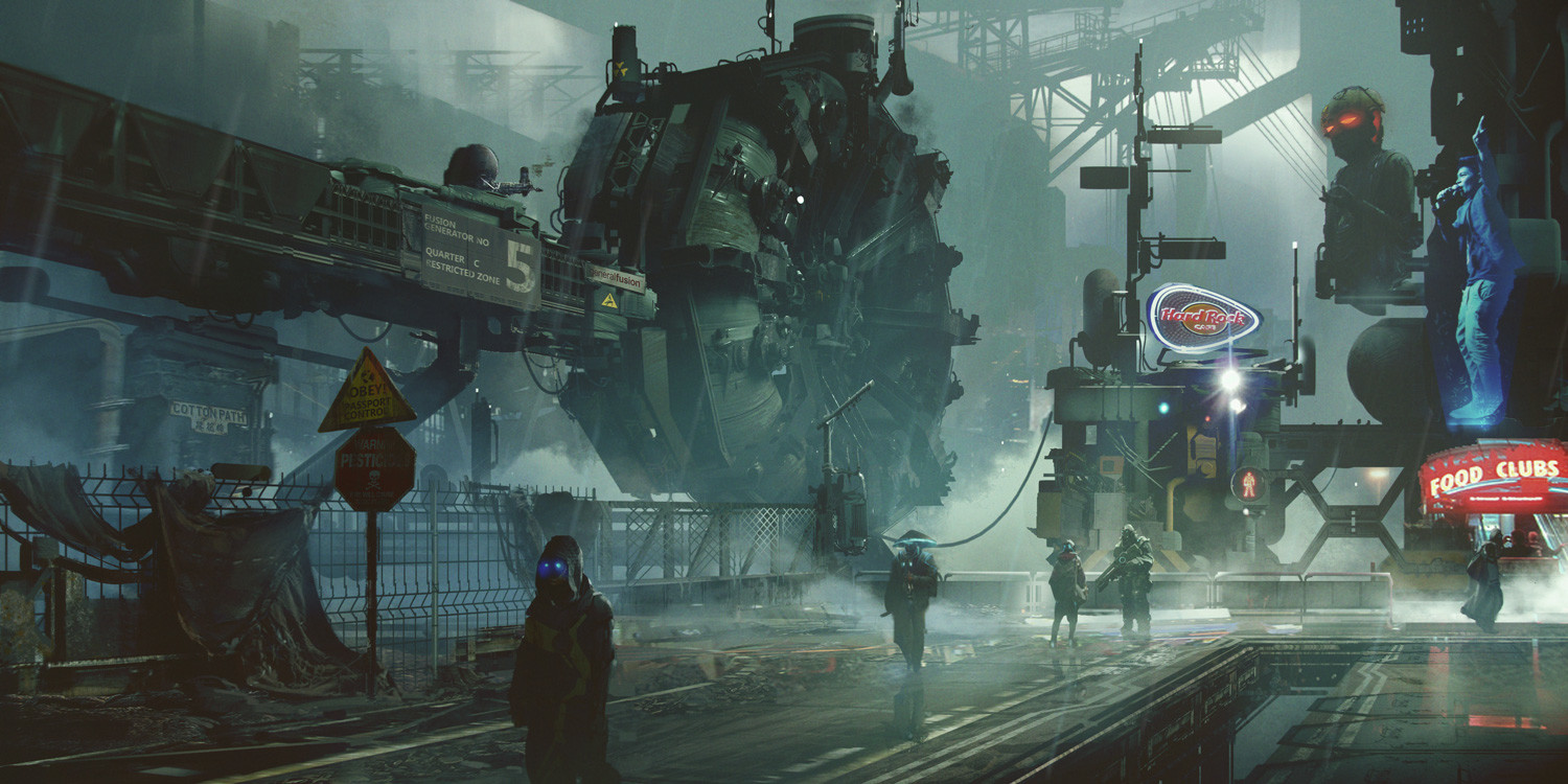
deviantart source

artist's artstation || twxtter

i honestly don't even know if hanging fallen marines' shoulderplates is a canon tradition; but i love the idea

24
submitted 2 years ago* (last edited 2 years ago) by Zeus@lemm.ee to c/imaginarysteampunk@lemm.ee
 

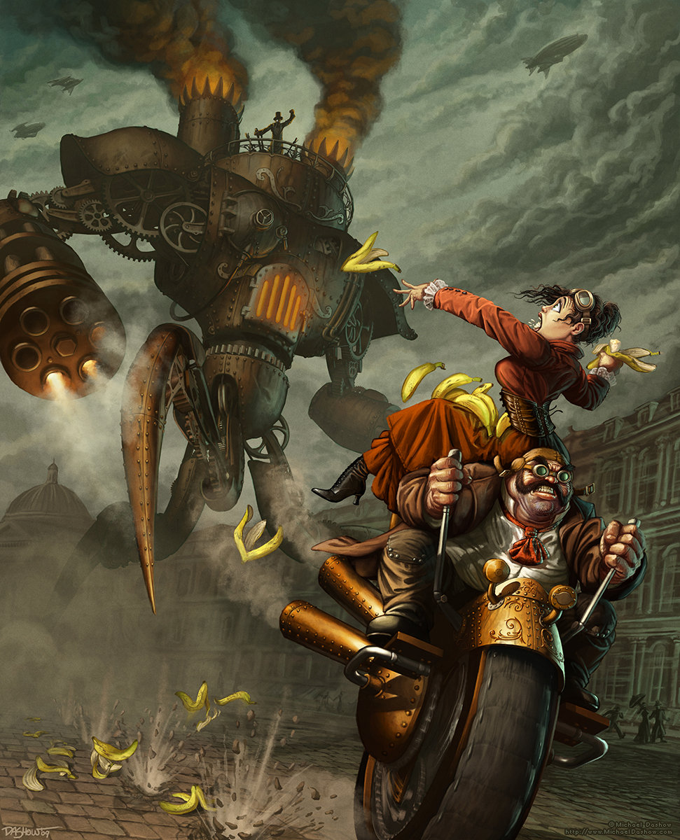
After placing in the CGSociety Uplift Challenge with my 'Adorable Alien' entry, I was made a judge and ineligible to win any prizes in the following contest. However, the theme was Steampunk and I'd been dying to work on a steampunk painting. So I worked on this piece for the challenge anyhow: I love getting feedback from folks and "hanging out with" friends during the Challenges, and who wouldn't want a steampunk piece in their portfolio? (And this piece turned out to be the first of many, MANY steampunk paintings, the one that really got me hooked on the genre.)

As with the previous painting, I built some base geometry for the mechanical bits in 3DS Max, but did all of the paint and color-work in Photoshop.

source || artstation site || artstation page


source[^1] || deviantart

imaginative title, i know

i realise the train isn't the full focus of this picture; but i like the way it's used to show the scale of the dinosaurs by being absolutely dwarfed by the them

[^1]: ignore the popup, it’s just a server error

57
submitted 2 years ago* (last edited 2 years ago) by Zeus@lemm.ee to c/imaginarywastelands@lemm.ee
 

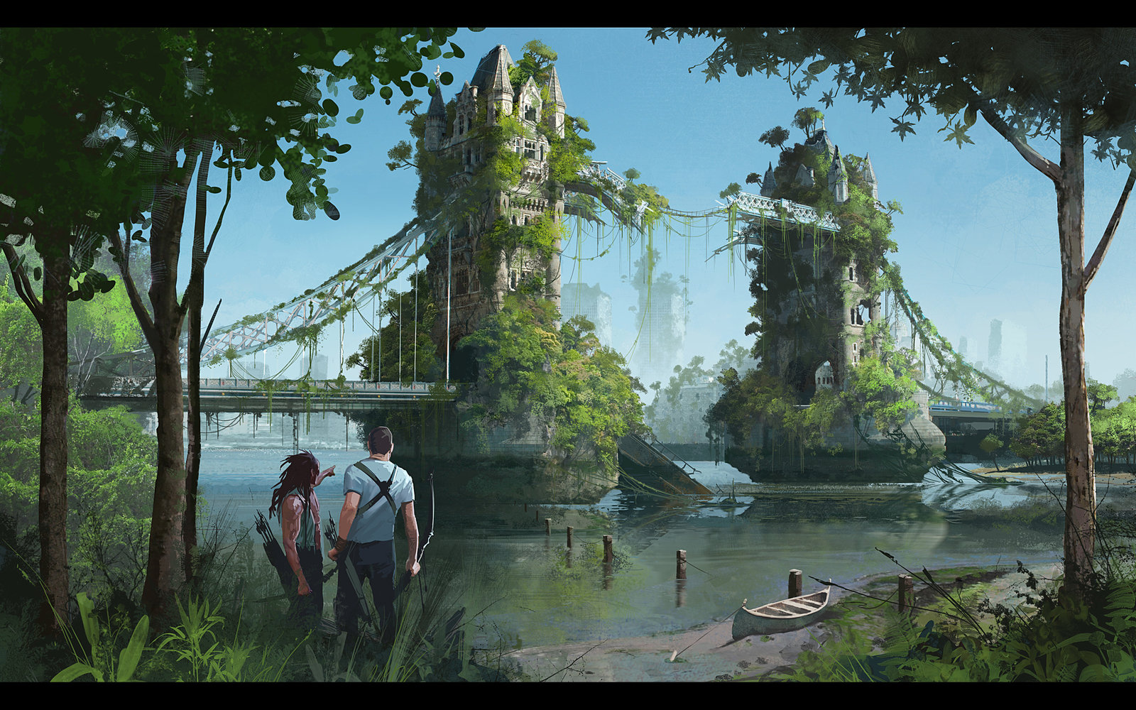
source || artstation site || artstation page

i almost used this as the 'sphere banner, but it was just slightly too tall

16
submitted 2 years ago* (last edited 2 years ago) by Zeus@lemm.ee to c/imaginarycathedrals@lemm.ee
 

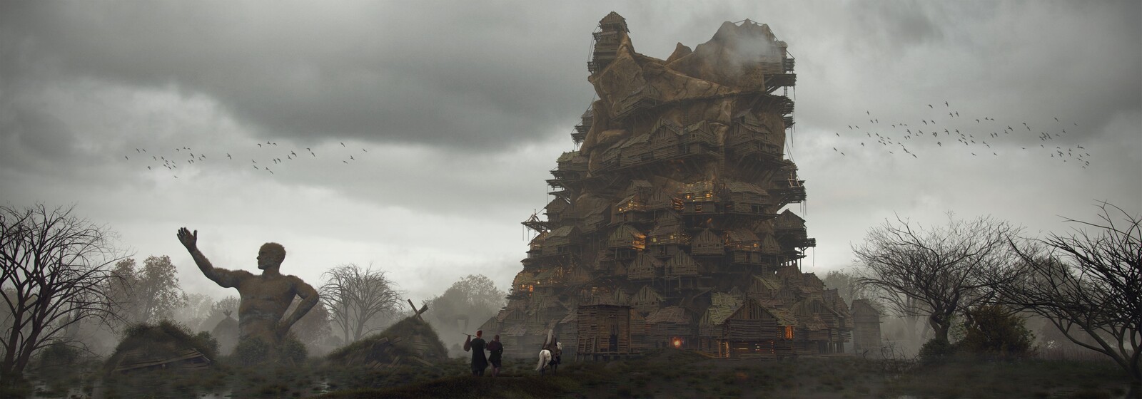
artstation site || artstation page

more primaris armour :( but i like the card design and the titan in the back


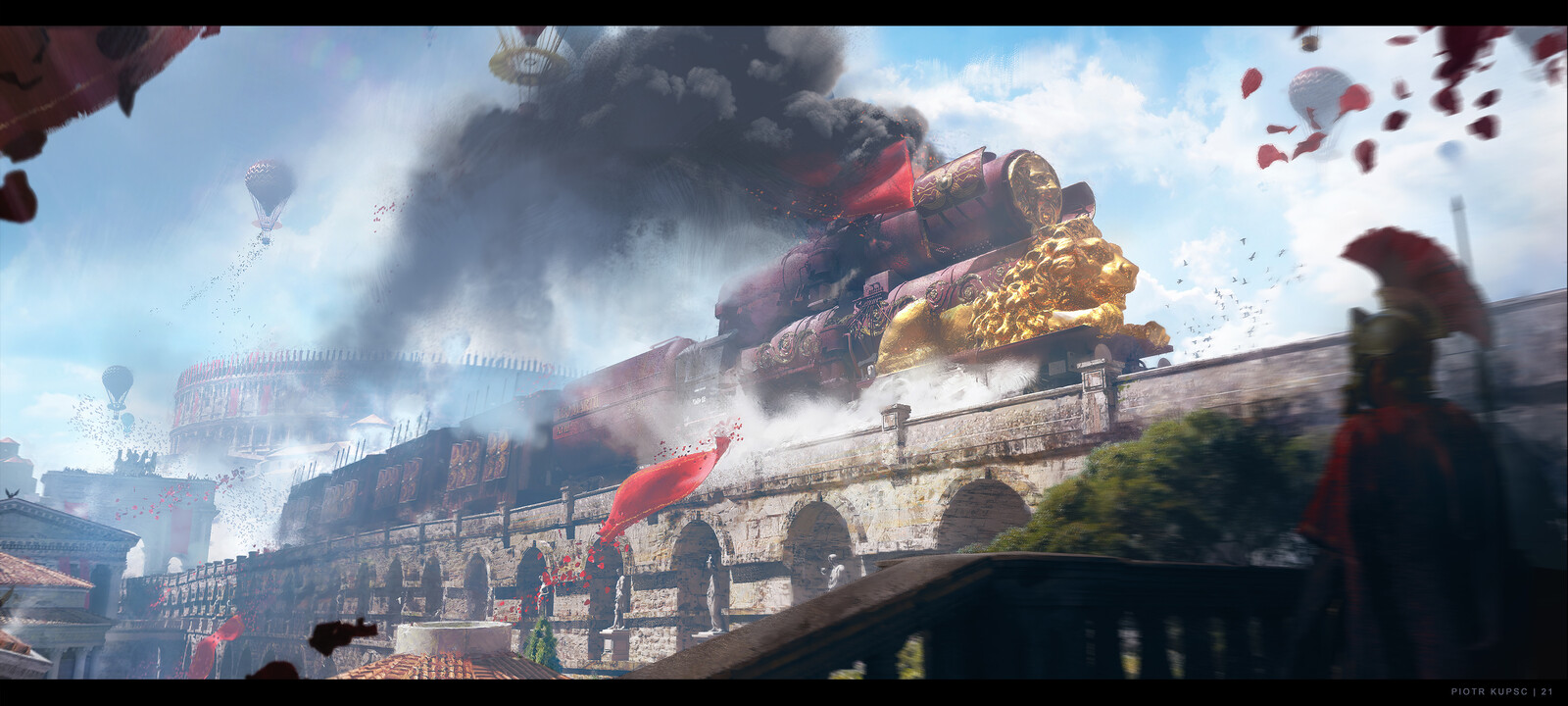
Mix of two time periods; Victorian era and the Roman Empire. Hopefully i get around to exploring more of this mix as i had a blast doing it.

artstation site || artstation page


cgsociety source

also, i'm pretty sure it was also on his artstation, but he seems to have deleted it


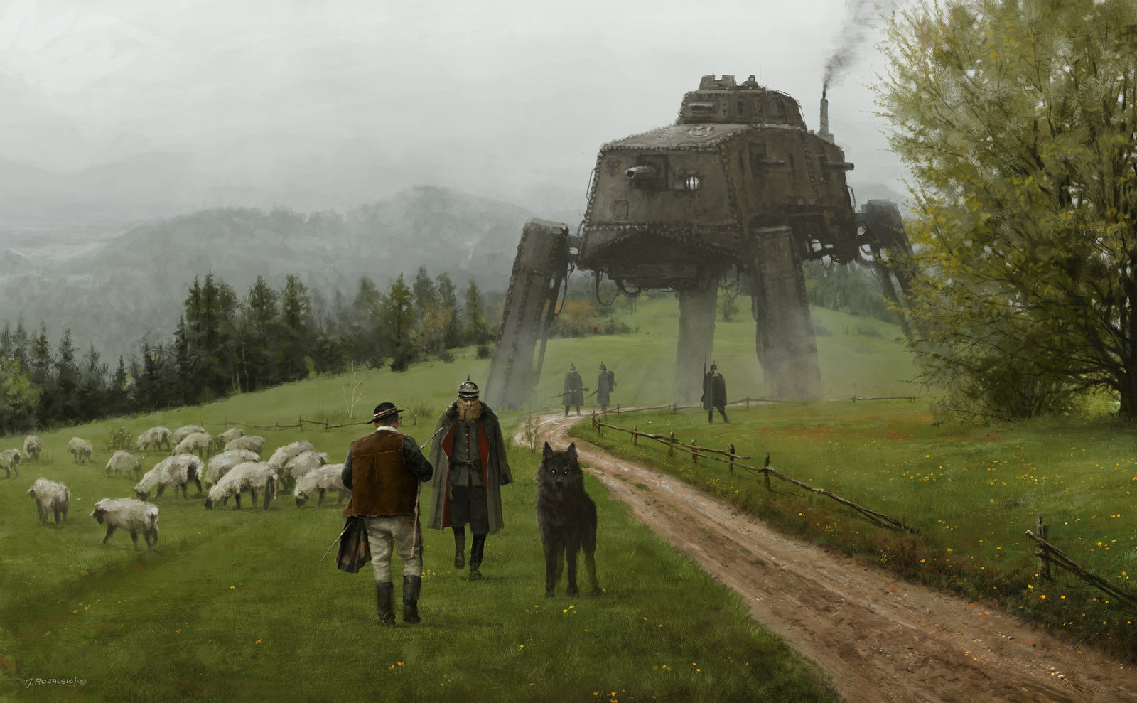
new painting from my 1920+ series and Scythe game, hope you like it, mech design is based on the German A7V tank from 1917-1918, cheers!

artstation site || artstation page || tumblr

jakub rozalski is also the artist of iron harvest, as well as scythe


deviantart source

Rusałka is a slavic female demon usually appearing around lakes, ponds or rivers. She deceives men and drowns them. I wanted to show her as a dead corpse that uses a charm, so that she looks like a pretty woman when out of the water.

I've had some voices wondering about the swastikas on the rims of the guys shirt. So to make it clear. I have no connotations with any extreme right wing parties nor do I keep any nazi or racist oriented beliefs. Swastika has been used for hundreds of years in Poland, before Hitler stole it and spoilt it for everyone. The action of the image takes place in 9th or 10th century. If you want to know more about swastikas just wiki it. There is a really broad and interesting article written about it.

he's deleted everything on his artstation, although it's still available as a print

view more: ‹ prev next ›