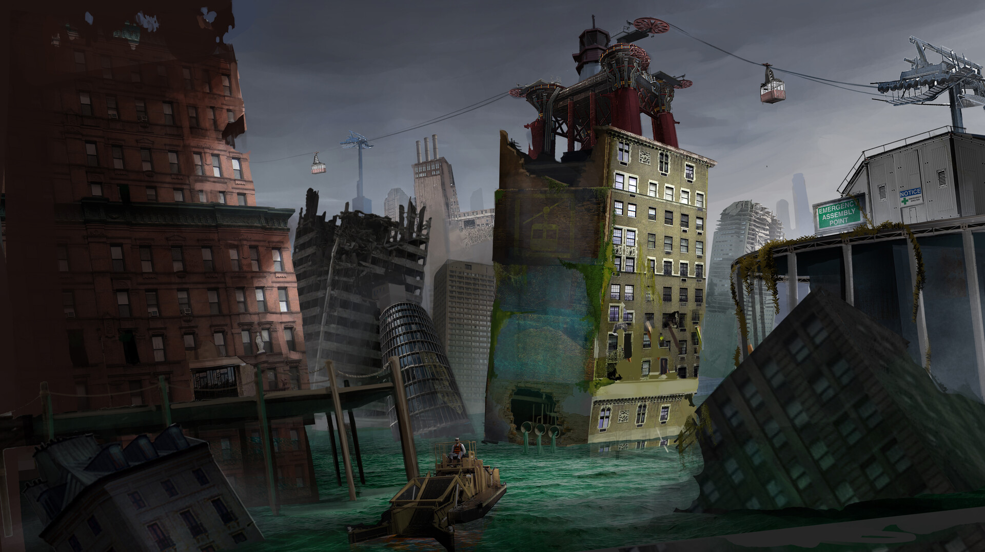
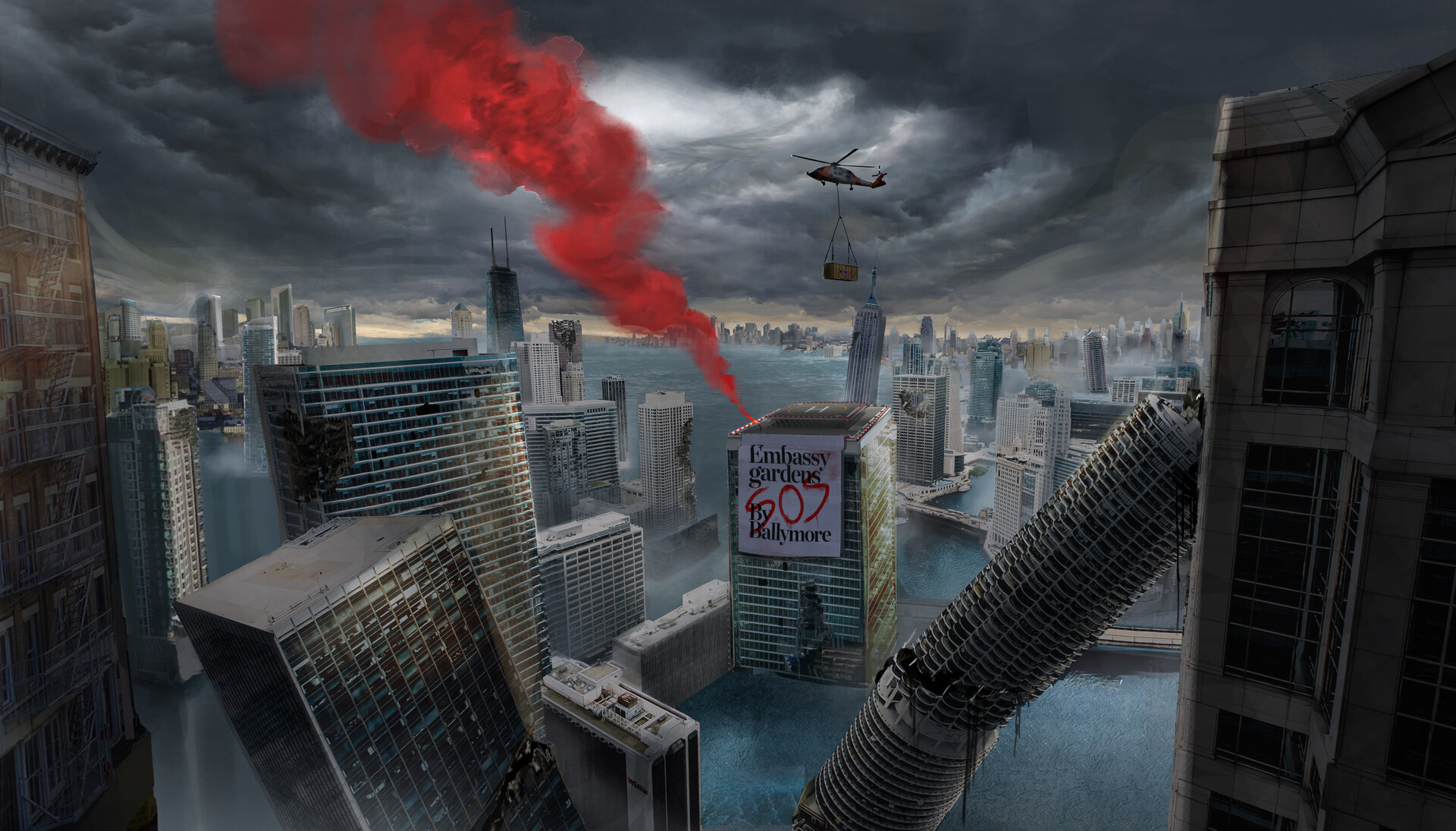
Zeus

joined 2 years ago
MODERATOR OF
[–] Zeus@lemm.ee 0 points 2 years ago (3 children)

meh, subjectively i find that creates a "worst of both worlds" situation. but this comment was more about the futility of the development time that went into this specific feature

[–] Zeus@lemm.ee 0 points 2 years ago

maybe; but if the location of menu buttons hints at their use then the hamburger should collapse the side drawer like the one on e.g. youtube, but i doubt it does

[–] Zeus@lemm.ee 2 points 2 years ago (2 children)

I had to look up Fitts’s law, and I’m not sure I get it. Could you explain what you mean?

basically; the speed that it takes to click a button is dependant on the size of the button and the distance from the cursor. however, buttons at the edge of the screen have effectively infinite size, as they can't be overshot. the most used actions should be placed there, as they are the easiest to click by muscle memory (particularly the corners, as they have infinite size in both dimensions)

on windows, kde, cinnamon, etc.; by default the bottom left is start, the bottom right is show desktop (this one i can't explain), and the top right is close maximised window. the top of the screen is also used for other window-related actions like minimise, restore, change csd tabs, etc.

gnome flouts this by having most of the top of the screen doing nothing (most of it is completely empty) apart from rarely used actions like calendar and power. and the bottom right and left doing nothing[^1]

did i explain well?

ETA: I kinda feel like mine was about KDE not being a fit for me personally, and yours was a slam on Gnome rather than a statement of personal preference.

nah it was very much a personal thing: some people like having a minimal and clutter-free feature set; i like having as many features as possible, because then i find features i didn't even know i liked.[^2]

as for the top bar: this one confuses me - it just seems objectively bad. but obviously it's not as some people clearly like it. i haven't had anyone actually explain to me why, though

[^1]: i mean they also ignore it in other ways, too

[^2]: i didn't know how useful a terminal embedded in the file manager would be until i started using dolphin, now i can't do without it

[–] Zeus@lemm.ee 3 points 2 years ago (4 children)

as someone who's not scared of computers, i have no idea what they do. i assume the right one is icons/list/compact[^1] not a waffle menu, but the hamburger and kebab? i have no clue

[^1]: though why it's showing list when the current view is icons, i don't know either

[–] Zeus@lemm.ee 1 points 2 years ago* (last edited 2 years ago) (4 children)

every time i try to use gnome, i end up spending all my time going "dammit, where are all the bleeding features"

(also the lack of fitts' law adherence due to that pointless bar at the top)

[–] Zeus@lemm.ee 2 points 2 years ago (11 children)

yep, that's me

[–] Zeus@lemm.ee 9 points 2 years ago (14 children)

i'm not even sure it's worth having an option. i don't think i'd even have noticed a difference, apart from the menu button being in a slightly different place to every other gnome app. it's fine; but it wasn't worth the development time

[–] Zeus@lemm.ee 1 points 2 years ago* (last edited 2 years ago)

well that's better than i expected[^1]. thank you for answering!

[^1]: (although worse than i'd hoped; i've stopped using webp altogether, even though it's objectively better. i think jpeg-xl will be available on chrome soon after hd-dvds are playable on playstations)

[–] Zeus@lemm.ee 48 points 2 years ago* (last edited 2 years ago) (55 children)

who even decides what's "modern" anymore?

can anyone, honestly, without reading the article (or guessing from the headline), tell me which of these is the "modern" design?

screenshot of the nautilus file manager in light mode screenshot of the nautilus file manager in light mode

edit: people are getting confused by the fact that one is tree view, not icons view so i changed the image. old image here

[–] Zeus@lemm.ee 27 points 2 years ago* (last edited 2 years ago)

thank you for your work sunaurus, and i'm sorry you had to sort through this

(particularly annoying though, as i never got around to adding a user banner; and i had one in mind as well. i wish there was some way to externally host avatars and banners)

[–] Zeus@lemm.ee 1 points 2 years ago* (last edited 2 years ago) (2 children)

just out of interest db0, did this thread in any way change your opinion on webp?[^1] i'm just constructing a pet theory on internet discussions

(sorry to necro an old thread, and i'm sure you have other things on your plate right now; i'm just interested)

(also completely off-topic; i'm surprised your blog still has the wordpress favicon. i would have thought you of all people would have changed that)

[^1]: or tumblr, for that matter

[–] Zeus@lemm.ee 0 points 2 years ago* (last edited 2 years ago)

if you click on it or focus it in any way - it's the same as windows explorer; and it is the best way of doing it i think. but i meant that by default it's a series of buttons, whereas some file managers default to (and dolphin has the option of) always showing a textbox there

i wish there was an option to show the .. folder, though. that's the only feature i miss in dolphin

4
"Drowned World" by Darren Lai (cdna.artstation.com)
submitted 2 years ago* (last edited 2 years ago) by Zeus@lemm.ee to c/imaginarywastelands@lemm.ee
 

Day 1: Drowned


telecabins going to and from a platform atop a ruined towerblock, sunken into an emerald sea

Day 365: Rebuild

With the ever rising ocean levels at its peak and a large rainstorm consuming the whole world, the Earth has been drowned. Cities destroyed and landscapes sunken, the human race has to adapt to this new world in order to survive.

artstation site || artstation page

0
"Ambush" by John Blumen (www.johnblumenillustration.com)
 

source^[but, er, the javascript's broken (why do artists always have shitty broken websites?)]


Private fighter of Inquisition is our first SKVERNA character.

Inquisition fighters are not involved in the main battles against Skverna, they are in charge of maintaining the order within the Factory Fortresses. They are also searching for new focuses of infection, collecting the artifacts, and cleaning the Oldest Town's terrains.

artstation site^[i'm not sure i could whole-heartedly recommend browsing his artstation..?] || artstation page || cara.app

secondary source


used for the cover of "The World Next Door" by Brad Ferguson

source^[on page 12, as of posting]


source^[sorry the website is not great]

in shadows: a blackguard with a gun on a roof, watching two unsuspecting victims

the narrows: a drunkard on the floor outside a pub, being sniffed by a dog

in shadows: artstation || behance

the narrows: artstation


I had a chance to work with ExNi Games on their new pc game project. I love the world they created and did some concepts for them.

i think this game has been quietly cancelled unfortunately. the concept art looked really good

artstation site || artstation page

12
submitted 2 years ago* (last edited 2 years ago) by Zeus@lemm.ee to c/imaginarytrains@lemm.ee
 

wooden mansion on two sets of train tracks, through a snow-covered mountain vista

strongly reminds me of the mortal engines series - i'd love a spin-off based on trains (although i don't quite know how that would work)

artstation source (image 1) || artstation source (image 2)

Hey guys, Here is my submission for Artstation Challenge.

The idea is inspired from "Moving Castle" from Miyazaki's film. I decided to do moving house / town for this challenge. Here is my process for this challenge : (https://www.artstation.com/contests/wild-west/challenges/44/submissions/28600), Thank you.


artstation site || artstation page

This is a fun art ,I imagined that a boy travel in a parallel world,it is similar to our real world but quite different direction,this is the first page,I think of this scene based on the London train station

view more: ‹ prev next ›