Holy shit, it actually happened. Big bird is about to lose an audience of nearly half a billion. The muskrat's ego truly knows no bounds.
Edit: apparently the title is a lie
Holy shit, it actually happened. Big bird is about to lose an audience of nearly half a billion. The muskrat's ego truly knows no bounds.
Edit: apparently the title is a lie
How is that ultimately any different from how usernames work in a centralized system? If you have a username on reddit, that's your username no matter what the subreddit/community. I understand how lemmy is analogous to email, but I'm not sure it's the right model for a link aggregator and discussion system.
I guess what I'm saying is that decentralization may be better served if instances operated as an internal load balancing system rather than strictly separate servers. This would also help with an influx of new users, so you can just spin up a new instance and lemmy just flexes up without having to manually direct users to sign up on a specific server/instance.
There can be a manual process for anything, but could be a major issue if lemmy receives a big influx of "redfugees" in the coming weeks.
Like I said, something like a distributed user index across instances could address this.
Heart attack from yelling at my computer screen, I guess
Right, but unless there's a migration or backup process I'm unaware of, doesn't your entire user history get torched if an instance goes down?
These are some issues I've been thinking about as well.
What's to stop someone from impersonating another user on a different instance? Maybe there should be a distributed user index amongst instances to prevent duplicate usernames?
I think making the federalized infrastructure incumbent upon users to understand and select is not something the average user is going to bother with. This is complicated problem, I don't know the answer might be off the top of my head.
And what happens when an instance goes down? Does every user and their history get torched? Is there a migration process or at least a decommissioning policy in place?
It occurred to me the hamburger button only shows on small displays. Nonetheless, I don't think it needs to be anything too fancy. Just a little tweaking to signify "this is a control element", similar to the sidebars. I just tweaked the CSS in dev tools and took a screenshot:
Also affects the element on wider screens

A couple of other things I noticed while writing this reply. It took me a bit to figure out that the [preview] button can be clicked again to return to "edit" mode. I think it the button should "edit" to indicate it's function during preview mode.
I'm not a fan of how the search button immediately redirects to the advanced search. Personally, I'd prefer a text box with execute (the magnifying glass) and advanced buttons.
One last thing (for now lol) I noticed while reading comments is that some of the control icons are hidden without first clicking the menu button to expand the list. It seems like an unnecessary extra step when there's ample space for all the icons anyway.
I got that earlier today as well. I wasn't sure if it was just overloaded or if it was a UX design oversight for accounts pending approval.
Edit: yeah, it must be the server load. I can't login from my other device.
Edit 2: nope, actually it seems to be a UX bug when the username or password is incorrect. Just keeps spinning instead of giving an error message.
I don't think "old" is a bad thing. Mostly, it's just kinda rough around the edges.
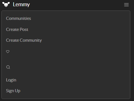
The menus could look more ... "menuy". Like when you open the main menu from the hamburger button on the top right, it's just a flat list of links with no styling other than font and color. It could use a visual bounding box.
The user menu (when you click/tap your username) could use the same treatment and definitely needs some left padding so the text isn't jammed along the edge.
The thumbnails should fill a fixed size box (though the size could/should scale with the user device's display).
Some of the alignments get out of whack when interacting with interface elements. Like the subscribe/unsubscribe links in the community lists (also, those could look more like buttons instead of plain links).
I could have sworn there was a dark mode just earlier today when I turned off the "night mode" feature in my browser, but now it's suddenly gone? In any case, would be nice to have, but my browser's built in night mode works well enough.
There's probably more, but I haven't been there that long.
Assuming you're not making this argument in bad faith (lol), why would private companies be any more trustworthy? They have every motivation to push whatever narrative their owners (read: advertisers) will pay for.