65
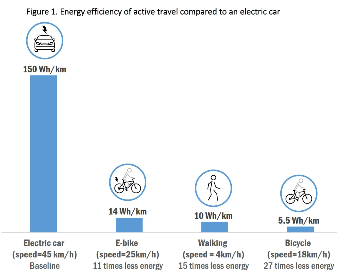
Energy efficiency of active travel (walking, cycling, ebike) compared to an electric car
(slrpnk.net)
cross-posted from: https://slrpnk.net/post/7273195
We're trying to reduce the numbers of hours a person has to work.
We talk about the end of paid work being mandatory for survival.
Partnerships:
/join #antiwork)cross-posted from: https://slrpnk.net/post/7273195
Good graph, hate the presentation of "X times less". Just not intuitive and very frequently calculated incorrectly.
Should say "27 times more efficient"
What? No, sorry an electric bicycle is not more efficient than a non-electric bicycle. What data fuckery is this?
Any electrical system is going to loose energy compared to the human body.
Edit: oh, this should be cross posted to data visualization gore. The more efficient thing is to the right and smaller. But the chart makes it seem like the electric car is the most efficient. Probably they should add red & green colors to make it clear that "electric car big line bad"
Also "27 time less energy" is like saying "cup half full" and should instead say "27 times more efficient"
The design of the graph aside, I would really like it to include something for public transit. A train may take 1 kWh to travel 1 Km but if that train is carrying 150 - 450 passengers how much more efficient is it than an electric car? What about a bus, light rail, or subway?
Or boat
an electric bicycle is not more efficient than a non-electric bicycle.
I thought that's exactly what the graph shows, though?? The way I am reading the graph, the ebike is less efficient per mile -- requires more energy per mile -- than a non-electric bike, just as you would expect.
You're right, its just not a very good way to display that data imho
Pretty fucked up. Do actual energy efficiency (calories burned per km) and you'll quickly see the bicycle is far above everything
From a quick search:
There was an article in cars magazine saying that cyclists were especially polluting. In teir study (in europe), the hypothetical cyclist was only eating Argentine beef lol. So no I do not swallow it.