Voyager
The official lemmy community for Voyager, an open source, mobile-first client for lemmy.
Rules
- Be nice.
- lemmy.world instance policy
Sponsor development! 👇
💙
All are very good, but B takes the cake for me personally.
B my lord
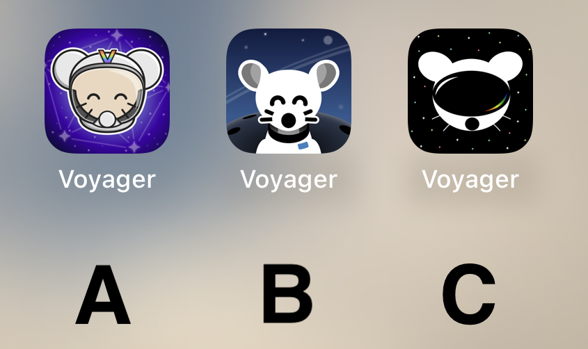
I like the idea of A, but as a Designer, B’s execution is way better and cleaner. Cohesive style, and very fitting for iOS. Sad that A is too cartoony. C is weird, the mouse is flat, and the “visor” (that looks like a huge mouth) is very detailed… don’t like it.
So, B, definitely.
C
B 100% !!! It's so cute
B
I can't decide between A and C... I am gonna go for C I guess.
BTW can we have different icons like Apollo had?
i vote for B cuz i think it's the cutest 🐭
C
B, good middle ground of clean design yet still has personality
I liked C best at first glance, but after looking at the screenshots my choice is A.
I prefer what we already have but if we have to change then go with A
Quick comparison on Android (custom launcher): https://i.ibb.co/XVnM2NL/comp.png
C
I’m just here to say: CHARGE YOUR PHONE!
Also, C A B is my ordered preference.
B
B
B
B.
Definitely B
B!! :D
Definitely A.
B is kinda creepy and C looks like a VR app.
I like B the best.
B
C
Really like A! Good job to all participants though!
I like the background of B the best. But it looks more like a dog and it's throwing me off. I like the character of the first one better, especially with the V on the helmet.
So I think I'm voting for A
B with the helmet of A (minus the “V”)
Voted for A, it’s definitely the cutest and I like the rainbow “V”. B has a nice background, though. C I think could do with better defining the shape of the head to look more like a helmet and less like a mouse wearing a VR headset :) Great job to all the applicants!
I'd go with A! I like the presentation of B better but the little guy reminds me of Chuck E. Cheese or fnaf. Character in A is adorable :)
I liked C too but it kinda looks like the Reddit guy in VR goggles.
A or C
B
Voted C. It's by far the most robust option. It looks stylish, professional, and could easily accommodate a flat, 1-color design.
I really like A, feels very professional
Why I chose "B": It's clean and professional-looking. "A" looks a bit complex in comparison, and "C" doesn't look much like a lemming.
C
I like A a lot, reminds me of the early iPhone days of tasteful skeumorphism.
B is probably my favorite tho -- definitely the cleanest.
C looks off to me, something about the goggles.
I vote B.
B but with the helmet and head of A would have been amazing. A looks to shiny rn.


