this post was submitted on 02 Dec 2023
387 points (96.4% liked)

KDE

7031 readers
29 users here now

KDE is an international technology team creating user-friendly free and open source software for desktop and portable computing. KDE’s software runs on GNU/Linux, BSD and other operating systems, including Windows.

Plasma 6 Bugs

If you encounter a bug, proceed to https://bugs.kde.org/, check whether it has been reported.

If it hasn't, report it yourself.

PLEASE THINK CAREFULLY BEFORE POSTING HERE.

Developers do not look for reports on social media, so they will not see it and all it does is clutter up the feed.

founded 2 years ago
MODERATORS
 

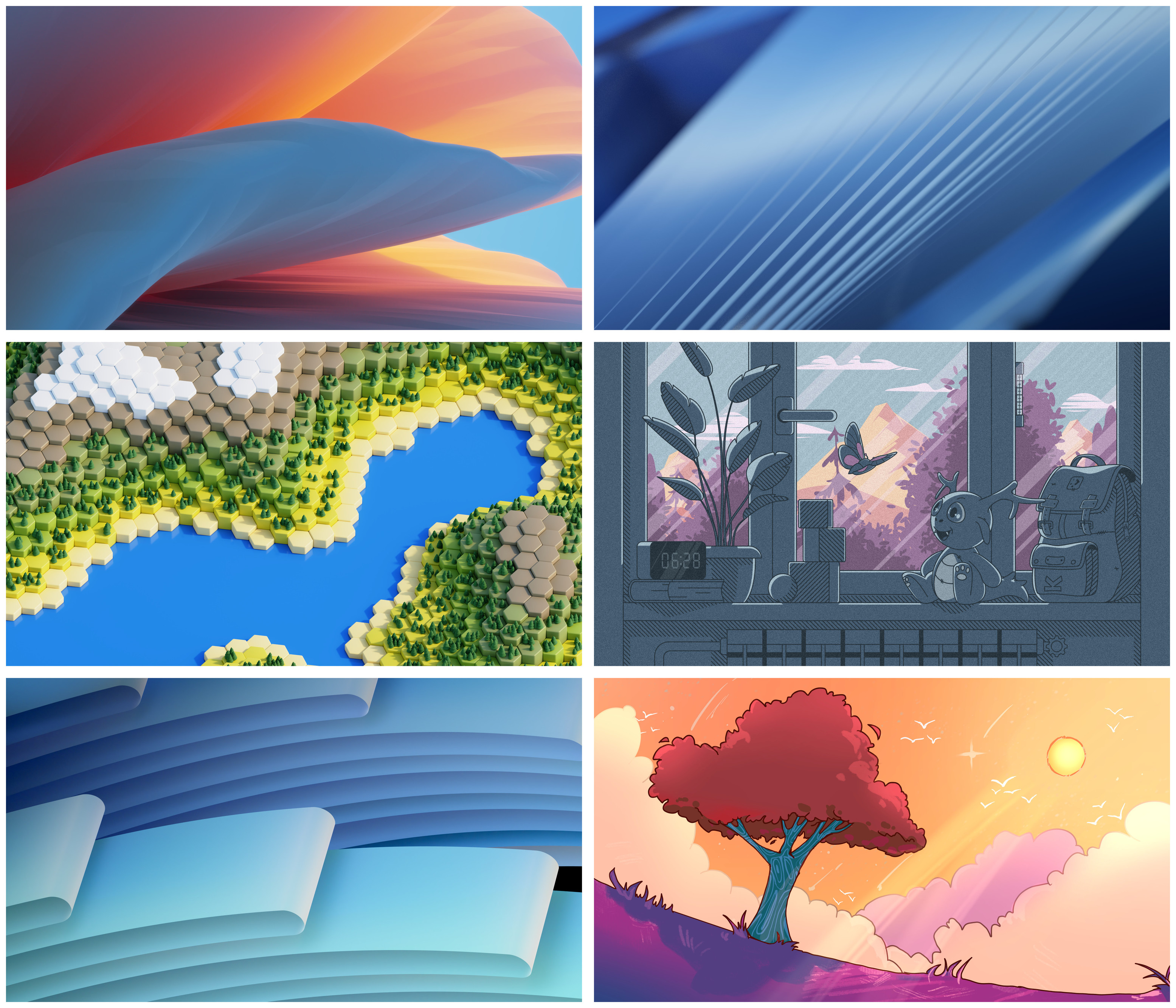
One of these 6 beauties will become the wallpaper for Plasma 6. Which one do you prefer?

#Plasma6 #wallpaper #desktop

@kde@lemmy.kde.social

---

Want to contribute to KDE? Become a Supporting Member:

https://kde.org/fundraisers/plasma6member/

Or donate to our community:

https://kde.org/community/donations/

(page 5) 20 comments
sorted by: hot top controversial new old
[–] semperverus@lemmy.world 1 points 2 years ago (1 children)
[–] juanmanuelgozalo@mastodon.social -1 points 2 years ago (1 children)

@semperverus @kde WTF dude?
Now I want to change my nick to "Semperversus". Fits in so many twisted ways! 😋

[–] semperverus@lemmy.world 1 points 2 years ago

I have no idea what you're on about. What did I do to upset you?

[–] Aldoo@lemmy.world 1 points 2 years ago* (last edited 2 years ago)

Non-figurative ones are boring, although beautiful: we had our share of those during previous editions of Plasma. But maybe they have a more corporate vibe... And they definitely are in line with current Plasma identity.

On the other hand, middle right and bottom right are really nice. I think I like middle right in particular, but it's probably too cute for me to be seen having such a wallpaper;). Bottom right it's much safer!

(That said... I will just switch to one of the "picture of the day" plugins, as usual).

[–] gbschenkel@fosstodon.org 1 points 2 years ago
[–] AVincentInSpace@pawb.social 1 points 2 years ago

I'm a simple guy with simple tastes so I'm going to be apparently the only person in this thread to say top right

[–] dephyre@social.linux.pizza 1 points 2 years ago
[–] trmsc@bildung.social 1 points 2 years ago

@kde@floss.social @kde@lemmy.kde.social I love all of these great artworks! 🥰 But the last one with the tree transports so much of detail and expression KDE stands for in such a lovely way which would make me choose this one! 😊✨

[–] Locutus@lemmy.kde.social 1 points 2 years ago

I like the bottom left cause it's more in line with the style KDE normally selects.

[–] Zitronensaft@feddit.de 0 points 2 years ago

If there wasn’t a weird monster, backpack, or out of place alarm clock in the middle right one, that would’ve been my favorite. The alarm clock isn’t even within reach of a bed to snooze it or turn it off. The backpack makes it too cluttered. The view through the window and the colors are my favorite, however.

As-is, the bottom two are the ones I like most. I love the color of the bottom left and I like the nature of the bottom right though I am not a fan of so much orange.

[–] tonbo@lemmy.world 0 points 2 years ago

middle left

load more comments
view more: ‹ prev next ›