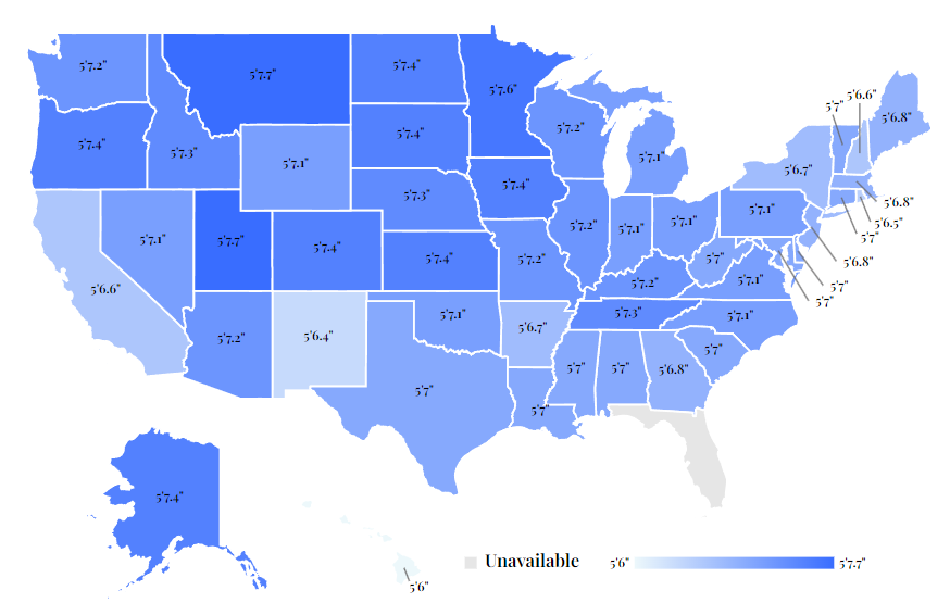
Such a beautiful color gradient to show a difference of 1.7"
this post was submitted on 14 Jul 2023
45 points (89.5% liked)
Data Is Beautiful
6847 readers
1 users here now
A place to share and discuss data visualizations. #dataviz
(under new moderation as of 2024-01, please let me know if there are any changes you want to see!)
founded 4 years ago
MODERATORS
I think this is just loosely a map of white people.
This had to include both men and women right?
Indeed - if you look at the table in the article, it lists averages by gender: https://wisevoter.com/state-rankings/average-height-by-state/
view more: next ›