This graph is terrible, since it gives no scale. A person with no knowledge beforehand wouldn't know if that's a 0.1 degree shift or a 20 degree shift.
this post was submitted on 07 Oct 2023
240 points (98.0% liked)
Climate - truthful information about climate, related activism and politics.
7136 readers
375 users here now
Discussion of climate, how it is changing, activism around that, the politics, and the energy systems change we need in order to stabilize things.
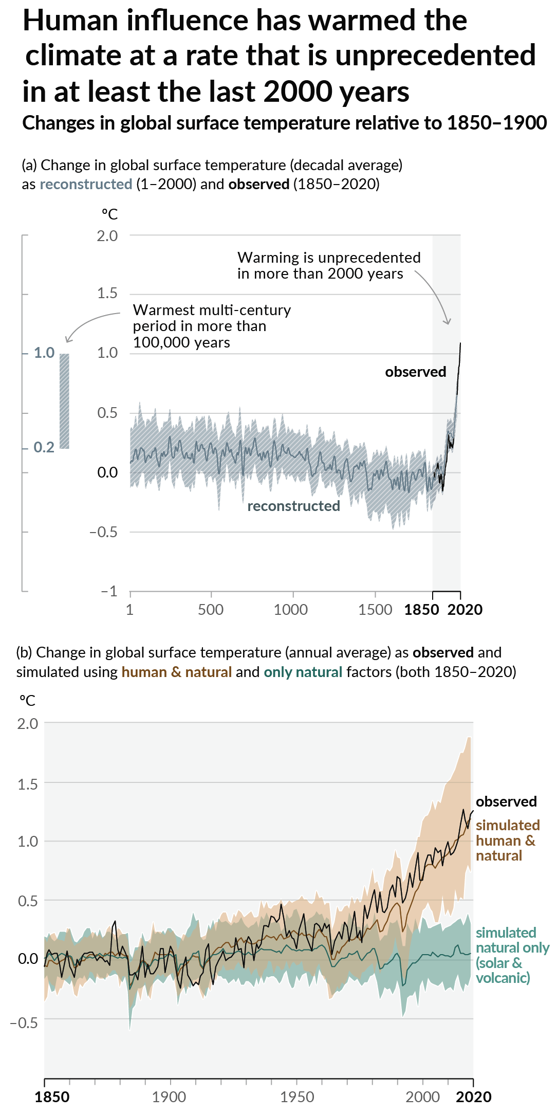
As a starting point, the burning of fossil fuels, and to a lesser extent deforestation and release of methane are responsible for the warming in recent decades:
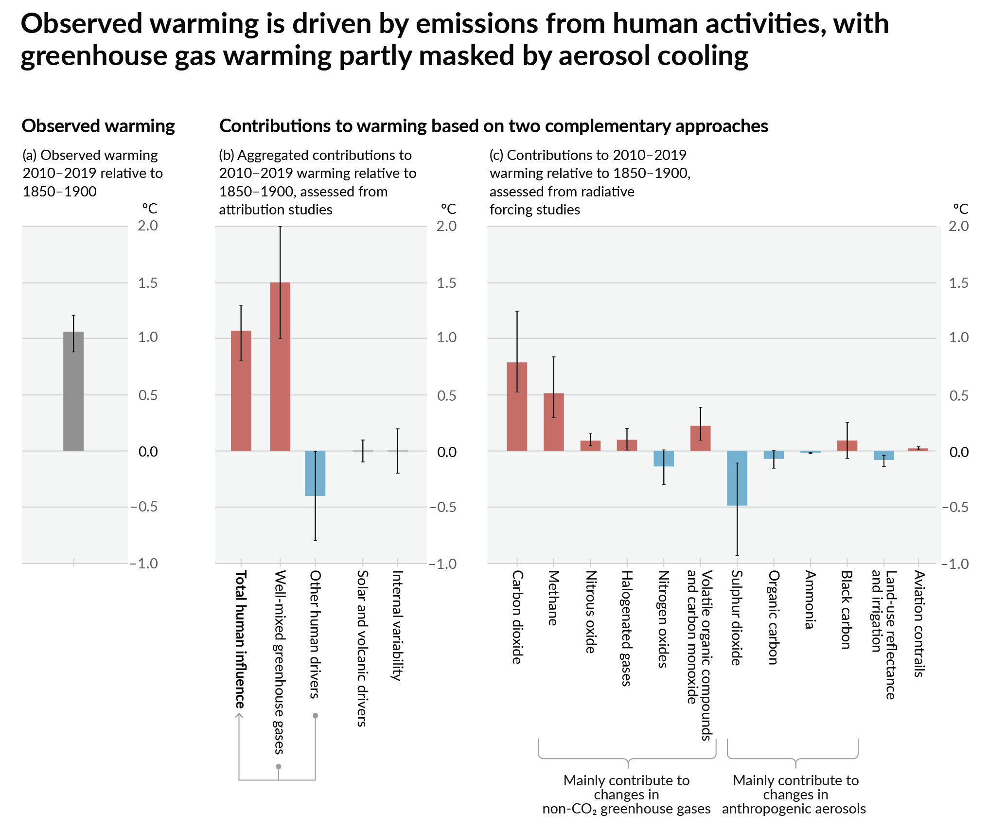
How much each change to the atmosphere has warmed the world:
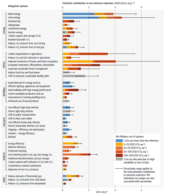
Recommended actions to cut greenhouse gas emissions in the near future:
Anti-science, inactivism, and unsupported conspiracy theories are not ok here.
founded 2 years ago
MODERATORS
That is a bizarre and confusing graph
A normal distribution graph is confusing?
Extremely vague units on both axes, throwing in the years on top makes horizontal also look like a timeline but its not.
Around here, it hasn't gotten above 100 in many years, so people like to point at that to say nothing has changed.
Never mind the fact that spring is starting earlier and earlier, dropping shitloads more rain than normal, and it's October and people still have A/C on...
I still need to mow, in northern ND in October. I swam outside in a pool last week. This is crazy.
I actually just mowed three days ago, and while the nights have made pools too cold, it's certainly still warm enough during the day.
Yesterday was the coldest it's been mid-day since spring, and it took two days of rain and cold fronts to get there.
Summer? It's autumn, 20°C, and native wildflowers are flowering again.
what's up with that graph? why not just have temperature on the Y axis and time on the X axis
edit: what about the scale too? how big is that shift?
They're trying to show a change in probability distribution, not just a temperature change over time. I agree that scale and such would be helpful.
No fucking shit. How many articles do we need saying this same damn thing?
Only when people paying attention to an issue are completely sick of seeing the same message again and again does it start to sink in with the general public. So a lot.
I don't need to look at a graphs, I can just go outside or read the daily news of "new record heat temperatures!"
Paywall
It's gift link so you shouldn't hit the paywall