Nipples.
A place to share and discuss data visualizations. #dataviz
(under new moderation as of 2024-01, please let me know if there are any changes you want to see!)
Nipples.
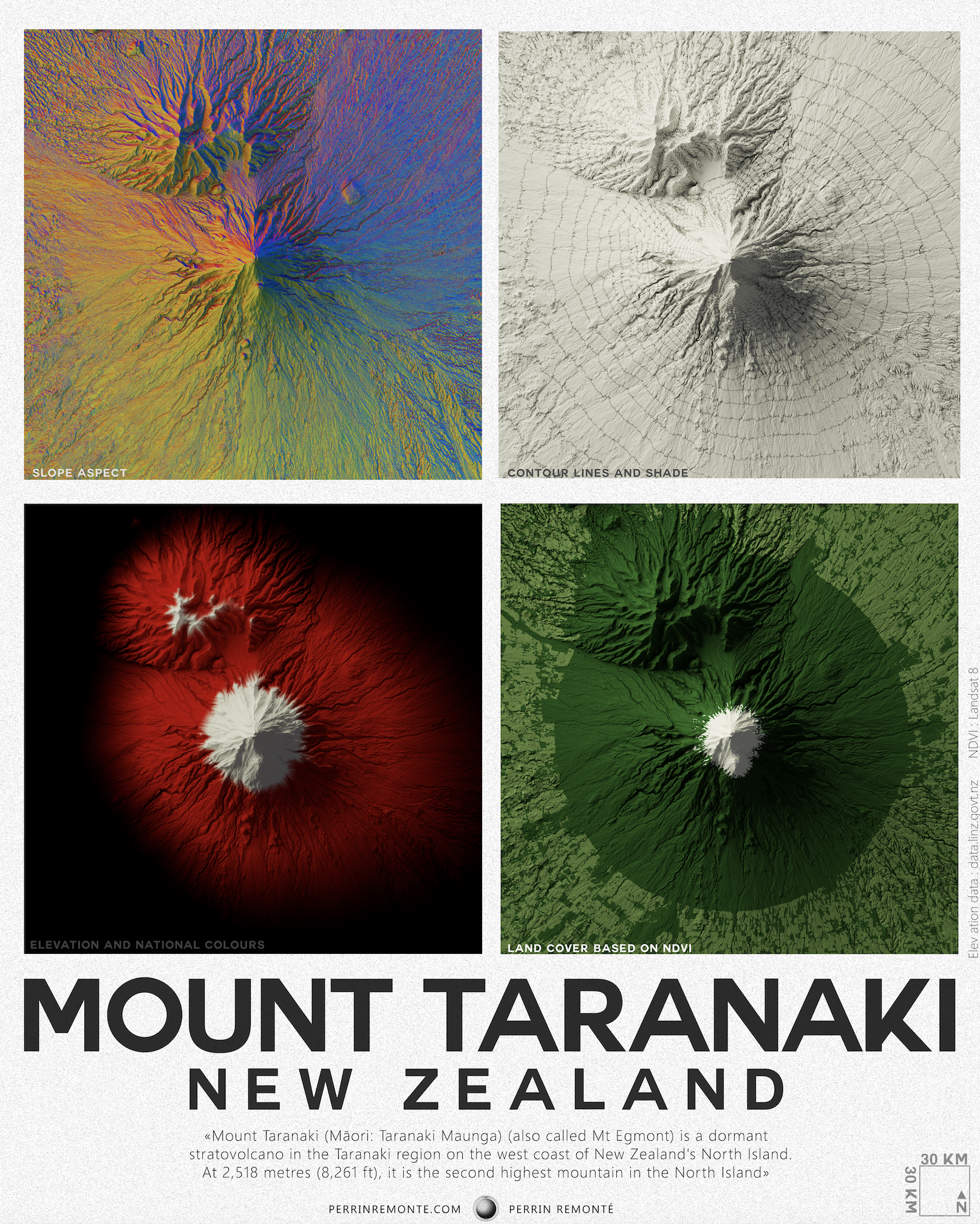
Very cool. The elevation and national colors in the bottom left I think could stand to have white font instead of the dark grey. It's a bit hard to read right now.