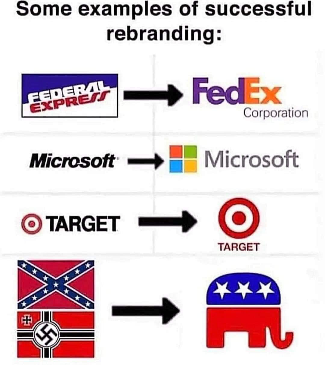
Seeing them side by side, the newer Microsoft logo sucks ass.
Welcome to politcal memes!
These are our rules:
Be civil
Jokes are okay, but don’t intentionally harass or disturb any member of our community. Sexism, racism and bigotry are not allowed. Good faith argumentation only. No posts discouraging people to vote or shaming people for voting.
No misinformation
Don’t post any intentional misinformation. When asked by mods, provide sources for any claims you make.
Posts should be memes
Random pictures do not qualify as memes. Relevance to politics is required.
No bots, spam or self-promotion
Follow instance rules, ask for your bot to be allowed on this community.
No AI generated content.
Content posted must not be created by AI with the intent to mimic the style of existing images
Seeing them side by side, the newer Microsoft logo sucks ass.
Imo, it peaked at 2001.

'85 looks modern
92-94 is GOAT for me
it's nostalgic, but it's a fucking horrible logo
But it is wooshing! With solid primary colors!
More pixels bro
Especially since there was no way to shrink it down and have it look good on the computers of the time, back when 640x480 was the norm.
there was an icon form that had 4x5 trailing squares instead of 6x7... commendable, but still noisy.
these are windows logos, not MS itself, and this is out of date, current windows logo as of 2021:

also i want to put the 2006 one in my mouth 👅
It's 18 by now so that's ok
give it to me give me the 18 year old softly glowing glass marble
What the fuck now!?
First time on the internet?
Im just genuinely surprised that 2006 was 18 years ago.
It's not fine if Windows doesn't consent and to get Windows to consent, you'd have to consent to so much crap that it wouldn't be worth it.
The original one is my favorite. Simple, easy to recognize at any size, looks good in both black and white and color. It's a pretty great logo.
The original logo looks like the generic spacers/blockers websites put up when the page loads but the content hasn't yet.
These days yes. In 1985 it must have been very futuristic and distinct.
I like 95 to 2k best.
Me too, I don't know if I'm biased by nostalgia tho
I'm partial to '95.
This damn picture created more conversation than the actual post
I'm a zoomer, and I have to say I prefer the current logo. The others just don't look clean. Big black borders, nah
I miss the sim card logo
I never got to see it in action since I'm too young, so miss isn't really the right word
But I miss it
I leik the SERKUL.
#BringBackThePacmanLogo
Is there any example in history of something coming to mean its opposite?
Quite a few. The most recent well-known one is people often now using 'literally' to mean 'figuratively,' but there are other examples-
A quantum leap is often used to emphasize a large step forward, however in physics it means the smallest possible change of state.
And this isn't quite a contronym, but "silly" originally meant "blessed."
“Silly goes the other direction,” Curzan explains. “Silly goes all the way back to Old English, when silly meant happy or blessed.” This positive term quickly changed. Silly became a synonym for innocent or harmless, and then became an adjective for something or someone worthy of sympathy.
Something we feel sympathy for is something that’s weak. And something that’s weak is unsophisticated. Finally, silly went on to mean ignorant and lacking sense.
https://www.michiganpublic.org/arts-culture/2013-10-27/the-changing-meanings-of-nice-and-silly
And, as that same article said, "nice" used to mean what silly means today.
And thanks to internet culture blessed now can mean something similar to silly.
That's nice, dear.
I'm generally a nice person. Not very silly though.
Yeah I can relate.
Also, the American Fascist Party is still officially called the Republican Party even though it wants to change the government form to theocratic fascism 🤷
Swastika is a good example.
Oh yeah! Its funny, you can go to 19th century monuments in the US with swastikas carved into the stone.
Is changing a logo but keeping the name considered rabranding? I thought it was when the name was also changed. Some oil companies did it to avoid the bad press on the old name.
Yes