this post was submitted on 22 May 2024
411 points (95.8% liked)
Microblog Memes
8883 readers
1834 users here now
A place to share screenshots of Microblog posts, whether from Mastodon, tumblr, ~~Twitter~~ X, KBin, Threads or elsewhere.
Created as an evolution of White People Twitter and other tweet-capture subreddits.
Rules:
- Please put at least one word relevant to the post in the post title.
- Be nice.
- No advertising, brand promotion or guerilla marketing.
- Posters are encouraged to link to the toot or tweet etc in the description of posts.
Related communities:
founded 2 years ago
MODERATORS
you are viewing a single comment's thread
view the rest of the comments
view the rest of the comments
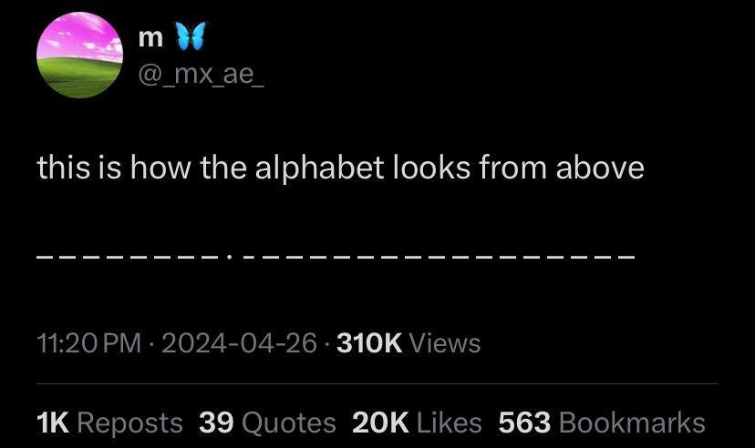
M and W should be wider than the rest, shouldn't they?
Maybe it’s a monospaced font
The i says otherwise.
That's not how monospaced fonts work
Then the "i" would likely be a dash too
𝚒𝙸
em dash to the rescue! —
Not if it's allegorical
Nor if they are all the same letter or same size letters
I and J are already different