this post was submitted on 17 May 2024
672 points (97.7% liked)
Data Is Beautiful
6847 readers
1 users here now
A place to share and discuss data visualizations. #dataviz
(under new moderation as of 2024-01, please let me know if there are any changes you want to see!)
founded 4 years ago
MODERATORS
you are viewing a single comment's thread
view the rest of the comments
view the rest of the comments

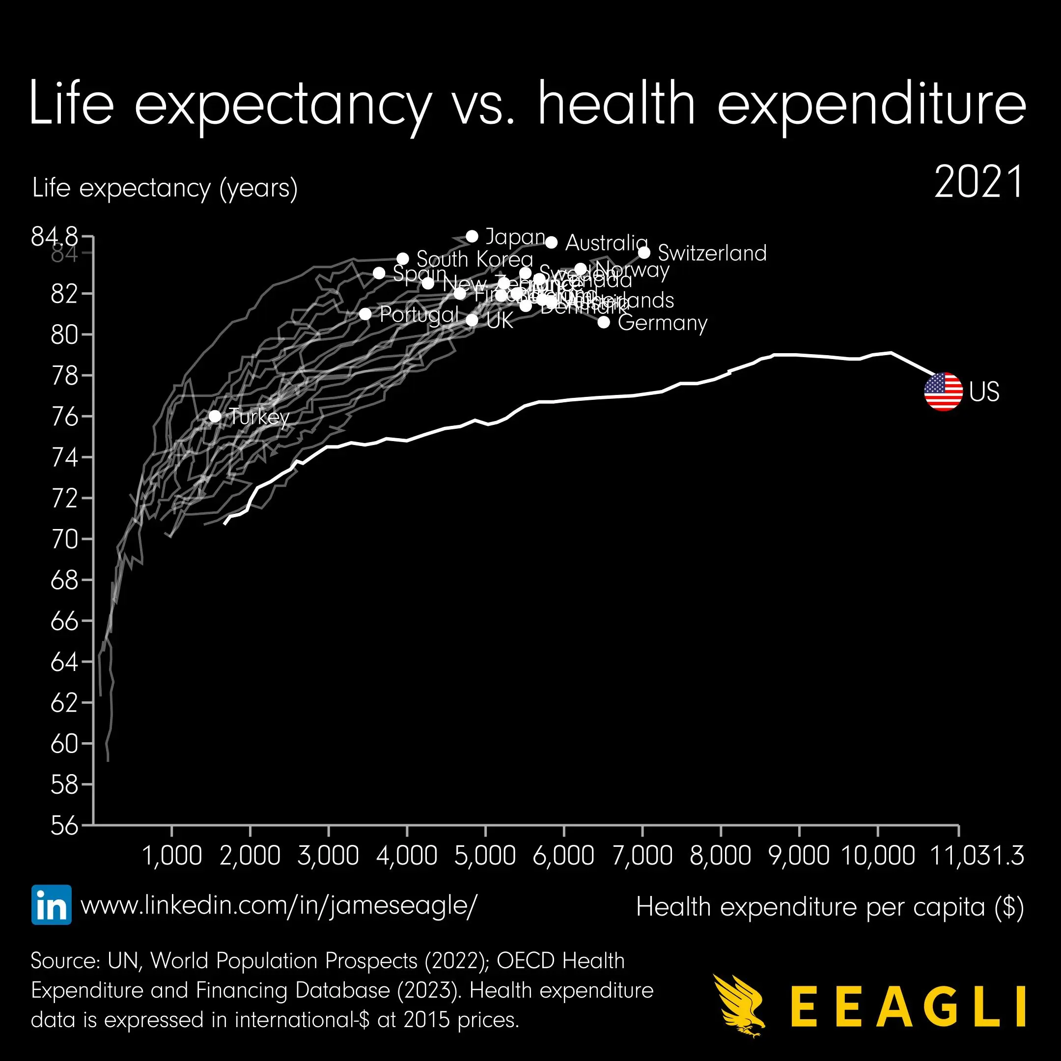
..how did the line come about? How did they determine what the life expectancy would have been with less expenditure per capita?
My guess is that this was a gif at some point and the line is historical data
Definitely, you can see some lines in the top left zigzagging back left, which would not be possible if each was a function of the x-axis. In fact, both axes are a function of the hidden z-axis, which is time and comes in discrete yearly steps, the latest of which (2021) is highlighted.