this post was submitted on 25 Apr 2024
1138 points (97.6% liked)
People Twitter
8021 readers
2100 users here now
People tweeting stuff. We allow tweets from anyone.
RULES:
- Mark NSFW content.
- No doxxing people.
- Must be a pic of the tweet or similar. No direct links to the tweet.
- No bullying or international politcs
- Be excellent to each other.
- Provide an archived link to the tweet (or similar) being shown if it's a major figure or a politician.
founded 2 years ago
MODERATORS
you are viewing a single comment's thread
view the rest of the comments
view the rest of the comments
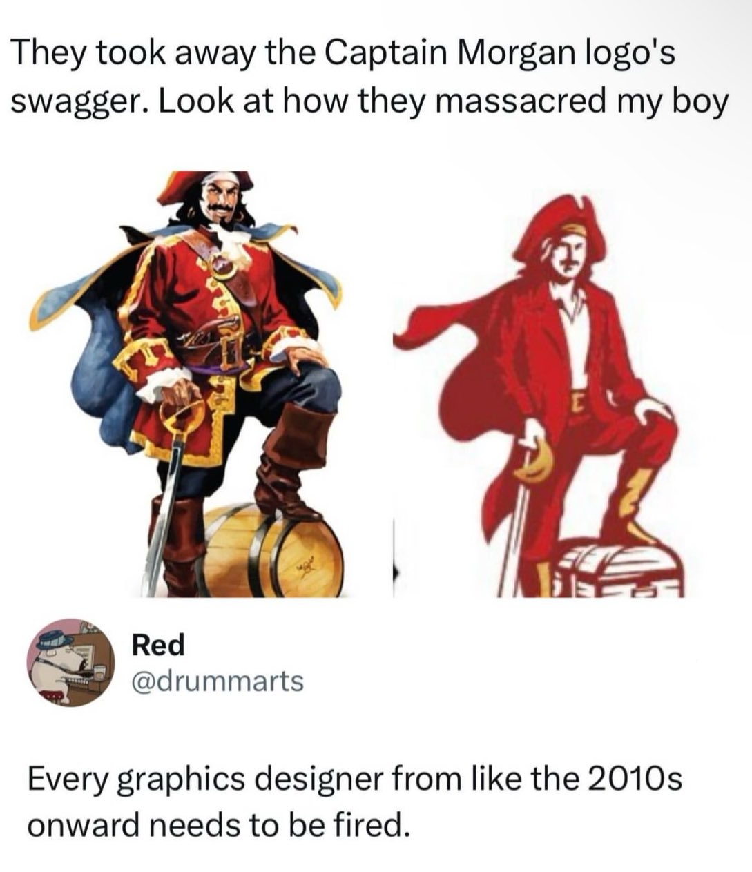
It's the shitty contagion of Flat design. Back around 10 years ago or so, the Flat craze began and everything that had details or depth was pounded down into simple flat design. Now everything has to look basic and boring, and it sucks.
I really like the simplicity of flat design. It makes things easier to find and recognize, especially for icons. Also easier for people with poor eyesight. It caught on for a reason.
Lemmy loves to shit on designers but there’s no way the designer had the autonomy to come up with this on their own. 100% guaranteed this idea came from marketing or an executive.
I don't like flat design because it's basic, boring, and sad. Windows 10 and 8 were ugly flat boring UIs for example. IMO peak GUI design was Mac OS X 10.6 like this:
Full skeuomorphism out the ass
Windows XP's Fisher-Price design and OG iPhone lickable buttons were an excess we should have learned from instead of dumping altogether. It's like music software started getting skins that were as non-rectangular as possible, and the whole industry went no, that's silly, let's stop.
Now you look at Windows 10 and it's not even clear which parts of a window are connected. Windows friggin' 95 had drop-shadows and relief shading. Why do modern OSs need to look like a Kraftwerk album?
Usability isn’t sad. I have vision problems and I very much appreciate the simplicity of flat designs.
Complicated designs aren’t always better designs.