this post was submitted on 15 Dec 2023
804 points (96.7% liked)
AssholeDesign
9513 readers
1 users here now
This is a community for designs specifically crafted to make the experience worse for the user. This can be due to greed, apathy, laziness or just downright scumbaggery.
founded 2 years ago
MODERATORS
you are viewing a single comment's thread
view the rest of the comments
view the rest of the comments
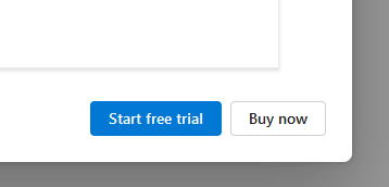
Dark patterns are taking over everywhere
Almost as bad as the "Enable new feature? / Not now" options
No, NOT not now; never. Never.
“Would you like to disable the ‘Not Now’ option?”
[ Not Now ] [ Just Once ]
[ Remind me later ]
“Would you like to disable the ‘Not Now’ option?”
[ Not Now ] [ Just Once ]
angry upvote :|
OMFG, the "not now" option (also disguised as an "ask later" button) makes me want to break things. I'm seeing this happening everywhere!
Load up an app? REVIEW THIS APP! (YES/NOT NOW)
Log into your bank account? SIGN UP FOR E-BILLING! (YES/ASK LATER)
Want to order something online? SIGN UP FOR OUR NEWSLETTER!! (OK/REMIND ME LATER)
Want to pay your utility bill? RATE OUR SERVICE! (OK/REMIND ME LATER)
🤬
“For more inf…” hyperlink that doesnt expand text even if there is space and takes you straight to the buy page.