this post was submitted on 28 Jul 2025
791 points (99.1% liked)
Microblog Memes
8805 readers
1857 users here now
A place to share screenshots of Microblog posts, whether from Mastodon, tumblr, ~~Twitter~~ X, KBin, Threads or elsewhere.
Created as an evolution of White People Twitter and other tweet-capture subreddits.
Rules:
- Please put at least one word relevant to the post in the post title.
- Be nice.
- No advertising, brand promotion or guerilla marketing.
- Posters are encouraged to link to the toot or tweet etc in the description of posts.
Related communities:
founded 2 years ago
MODERATORS
you are viewing a single comment's thread
view the rest of the comments
view the rest of the comments
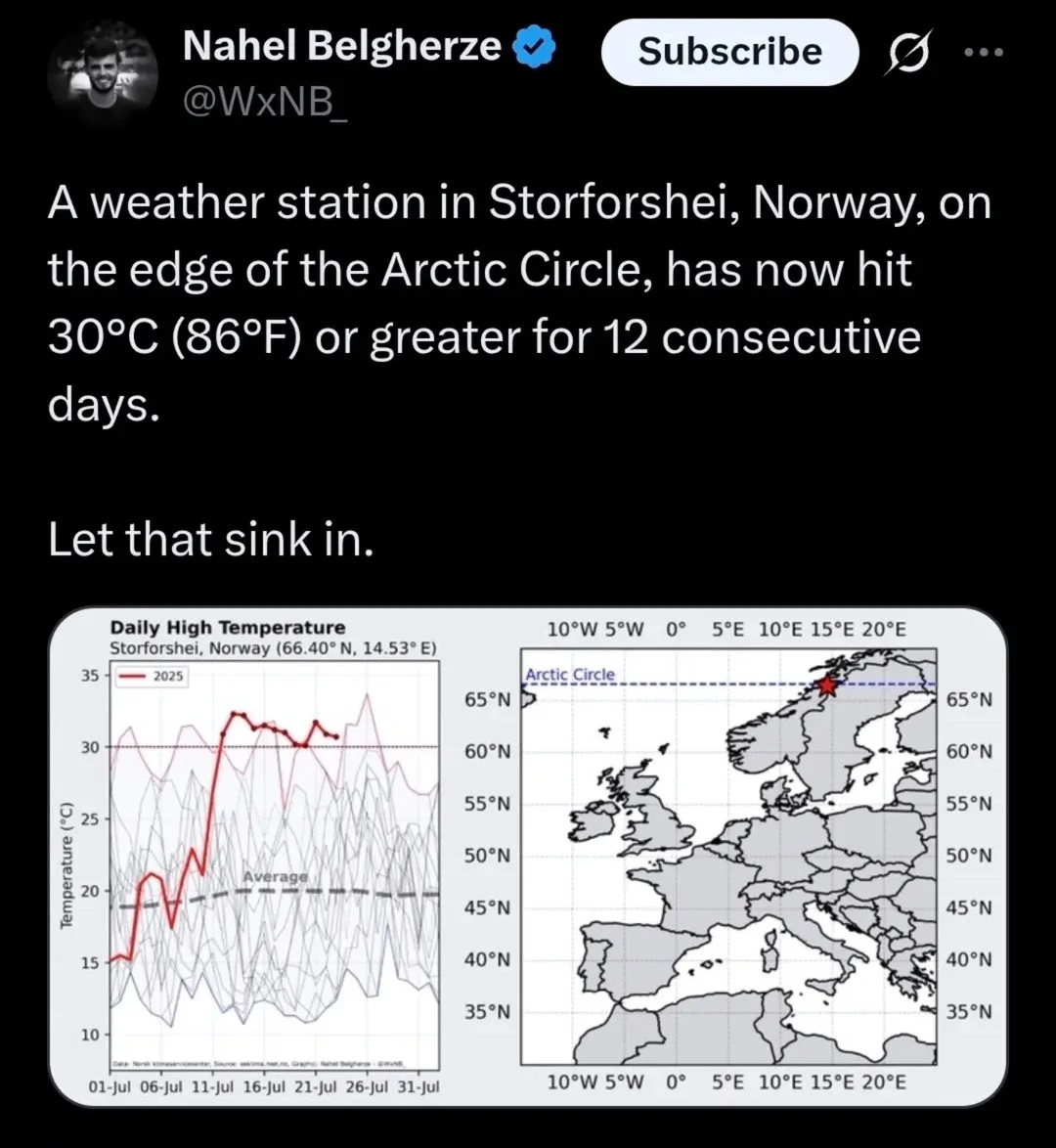
What year was this?
Edit: ok the thin red line is peak highs for all recorded years. The blue line is peak lows.
Blue?
It’s a lot harder to tell here since it’s a screen shot but the original post from Xitter the bottom line is blue.
The red isn't peak high for all years. According to the legend in the upper left, the red line is the high temperature for those days in 2025. The other lines peaking up around it are past years.
Can’t tell if you’re being sarcastic or not but I’m not referring to the 2025 line. I marked it in yellow in my screenshot
Sorry about that, guess I'm just blind. I'm viewing on mobile and all the smaller lines look Grey and didn't see the yellow line until the brightness was cranked up.
I had deduced that the blue one was historic minimums but I was thinking that the red one was last year temperatures. Thanks for the clarification.