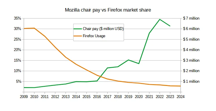
Total 2022 pay: $6,903,089
Total 2023 pay: $6,260,072 - a $643,017 decrease
Base chair pay: $600,000
2023 chair bonuses and other incentives: $5,622,600
Sources:
For comparison, here are other executive salaries ($0 bonuses for each)
| Executive name | Title | Total Pay (2023) |
|---|---|---|
| MARK SURMAN | PRESIDENT & EXECUTIVE DIRECTOR | 715,143 |
| J. BOB ALOTTA | SVP, GLOBAL PROGRAMS | 508,138 |
| ANGELA PLOHMAN | COO, SECRETARY & TREASURER | 452,234 |
| ASHLEY BOYD | SVP, GLOBAL ADVOCACY | 427,701 |
| ZHILUN PANG | DIRECTOR OF FINANCE | 273,069 |
| DAVID WALKER | SENIOR COUNSEL | 268,565 |
| LAINIE DECOURSY | DIRECTOR, ORG EFFECTIVENESS | 267,028 |
| JUAN BARANI | SENIOR DIRECTOR, GIFT PLANNING | 262,879 |
| STEPHANIE WRIGHT | SR PROGRAM MANAGER, MOZFEST | 236,785 |
I hate the color choice for the graph, I literally cannot tell which line is which. At least the data was down there.
In the nicest way possible, you are likely colorblind then.
It's green and orange, not exactly difficult typically.
Oh, I'm aware of that, got tested long ago. I get this is not a problem for everyone, but one of the lines being red or blue would have taken no additional effort.
I think the problem isn't about effort. Its something people aren't aware of(myself included).
Orange and red would be a bad decision, and green and red would also be impossible to distinguish if you’re colorblind.
You'd think this would be a basic usability thing. Just use colors that aren't a concern for colorblind folks. It's not hard.
It is hard. Not everyone knows what colors are a problem for colorblind people. There are also many types of color blindness.
The most consistent contrast I've found with my handful of colorblind friends is blue and green
I mean most people aren't aware of what colour's are bad for colourblindness, also orange and green make sense based on the content, Firefox is orange and money is usually green.