this post was submitted on 24 Jun 2024
200 points (96.7% liked)
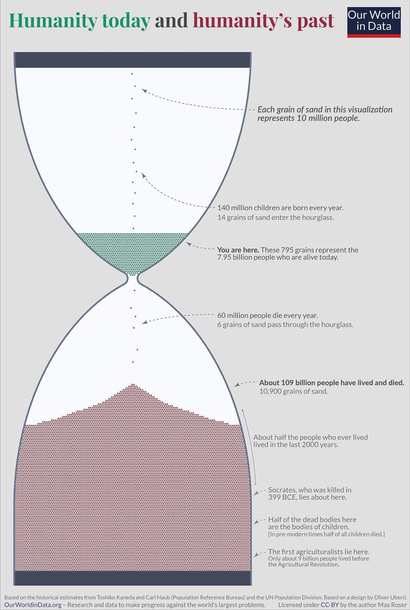
Data is Beautiful
2559 readers
2 users here now
Be respectful
founded 1 year ago
MODERATORS
you are viewing a single comment's thread
view the rest of the comments
view the rest of the comments
I think this is a really well done graphic. Details like the colour of the title corresponding to the colours of the data points… I like that. This is what I come to this community for. Thank you!