Avelon App

658 readers
1 users here now

Official community for the native iOS Lemmy app Avelon.

Available on the App Store!

Download Avelon

Wanna be a beta tester and see new features early?

Join the Testflight

Rules

  1. Posts should be related to the Avelon app in some way. Be civil :)
  2. If you have a feature request/bug report, mark the post with [Feature Request] or [Bug]. That way they're easier to find for everyone!
  3. If you're reporting a bug, please include the iOS version, Avelon version, the device you're using, and any steps necessary to reproduce the bug. Screenshots are also very helpful. The more information you include, the quicker the bug can be squashed! Thanks!

founded 2 years ago
MODERATORS
151
6
submitted 2 years ago* (last edited 2 years ago) by Disgusted_Tadpole@lemmy.ml to c/avelon@lemm.ee


Hi folks,

First, thank you for giving us Avelon. I (almost) only use it to browse Lemmy and it’s, in my opinion, the best app available on iOS.

So, I know it’s not possible yet to submit new post (I’m using Voyager to post this one) and add pic/text formatting on comments yet. But I also noticed two different behaviours between Avelon and Voyager when it comes to display comments with pic. Here is the same comment displayed on Avelon and Voyager :

Voyager

Avelon

(Custom caption is "Why are you booing me", to replace the link)

Voyager only displays my custom caption without showing the pic. Avelon does the opposite, it displays the pic without its custom caption/link.

To me, the best way to do it would be to show the link/custom caption and the pic in the comment. I believe Avelon’s way isn’t quite relevant atm as we just can’t see if there’s a custom caption. What do you think ?

Sorry if it has already be pointed out !

152


Hi everyone!

A new update for Avelon is now out on the app store! This update adds a lot of requested features, including new search functionality, a brand new in-app browser with reader mode, a better video player, user/community instances & lots more. It also fixes all the major bugs reported.

Let me know what you think!

Full Changelog

  • Added search!
    • Find posts, users, communities, comments...
    • Supports both filtering & sorting
    • Support for searching inside communities
  • Brand new in-app browser
    • Reader-mode support
    • Swipe to dismiss
  • Better video player
    • Fixed bug where videos would immediately pause background audio
    • Videos now keep track of where you were if you open a post
    • Hidden mute buttons for videos without sound
    • No more black bars around videos (unless they are too tall to fit on screen!)
  • Added option to show community/user instances
  • Added bio to profile pages
  • Added option to disable haptic feedback
  • Added swipe to dismiss for in-app notifications
  • Improved quicksearch performance and design (the one shown when tapping the feed title)
  • Compact posts now use the same font size as large posts
    • If you preferred the old look, there's a new setting to reduce the compact font size
  • The account switcher now shows instances if you have multiple accounts with the same name
  • Fixed bug where battery could sometimes drain in the background
  • Fixed bug where posts/comments would sometimes get stuck mid-swipe-gesture when you scroll
  • Fixed bug where thumbnail position setting wouldn't be saved
  • Fixed bug where subscriptions page could sometimes get stuck loading
  • Fixed bug where comments would sometimes be at the wrong depth after tapping "show parent comment"
  • Fixed bug with image cache where it could grow indefinitely
  • Cleaned up context menus a bit
  • Improved & cleaned up settings a bit
  • Other minor bug fixes & improvements
153


The explore community feature tab is great too. But i initially thought that was for searching communities, posts, comments and users.

The top drop down is initially the most confusing element when in the Explore tab. Why does it take me to All, Home and Local posts? I was trying to search or explore communities. I realise it’s the same drop down feature as in the Post tab. Not sure why the duplication.

Unrelated, the best feature in the app is how all the ui slides away when i start scrolling posts. chef kiss.

154
8
Data clear option? (files.catbox.moe)
submitted 2 years ago* (last edited 2 years ago) by willya@lemmyf.uk to c/avelon@lemm.ee


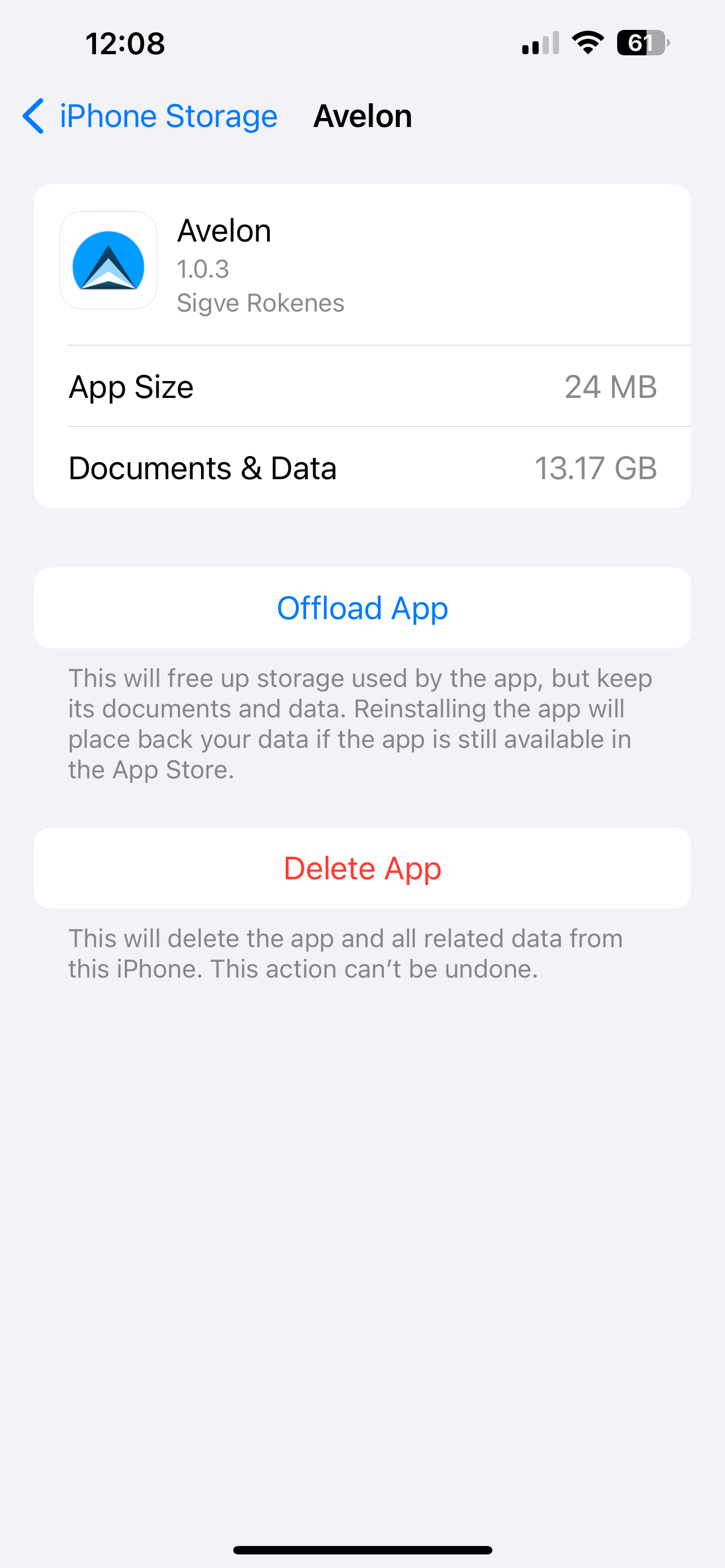
As of right now Avelon is taking up over 13GB of data on my device. We need a reset option or a max allowed option.

155


Hi, first, I am loving Avelon! Keep up the great work? Thank you.

A bug I noticed is that I don’t seem able to post to Avelon from the Avelon app itself. I went so far as to create a lemm.ee profile before realizing that wasn’t necessary. Haha. Anyone else experience this? Posting this from Voyager.

A feature that I’d love to see is more of a tweak; in the account switcher, it’d be nice if it displayed the instance after the username so that they are easier to distinguish between.

156
7
submitted 2 years ago* (last edited 2 years ago) by Levsgetso@lemmy.zip to c/avelon@lemm.ee


I listen to quite a lot of music and often browse lemmy while listening. I noticed that if you go over a gif it pauses your music, even though there’s no sound.

Other than that I really like using Avelon, it’s definitely the best app out there!

157


Apps like Memmy blur nsfw images, but when you tap on the image it opens it up in normal floating image viewer mode. When you swipe it up to close, it goes back to blur state again. Please implement something like that in Avelon.

158
 
 
159


avelon Suggestions on how to display hierarchy better/differently. The rainbow colors don’t match the accent color and they don’t really give a sense at what level you’re at. The gray lines from modern Reddit would be preferable, or I Bean where the accent colors just fade the higher you go up in level.

here is an example screenshot from Bean and a 3rd party Reddit client

For a quick win it would be great to have invisible lines instead of the colored ones.

160


Not sure why. But when I open the app it's always back to being on the left and I have to set it to the right as I like it.

161


Hi there,

How do you make a post using Avelon app? I couldn’t find any button to create a post!!

162


Hi! Loving the app so far and can't wait for posting to be added as a feature.

I was wondering if it would be possible to add "Source Sans 3" and/or "Nunito Sans" to the list of fonts to choose from?

As a visually impaired user I find these fonts to be particularly legible.

(So not "Source Sans Pro" (older version) or regular "Nunito" (rounded, older) to be clear.)

163


Hi everyone!

It's been quite the journey, but Avelon is finally on the App Store!

Click here to download!

The app is includes a lot of awesome features requested by the community, including:

  • Sleek design that fits right in on iOS & iPadOS
  • Highly customizable look & behavior
  • Mark read on scroll & hide read posts
  • Customizable swipe gestures
  • Multiple account support
  • Smart link previews in posts and comments
  • Support for videos, gifs, photos & other media
  • Custom font support
  • Write replies with markdown highlighting
  • Privacy focused - the app has no tracking of any kind
  • Gallery mode + hide bars on scroll = full immersion ... and a lot more!

Screenshots

Here's some cool app store screenshots of the app:

Developing this app has been one of the best development experiences I've had, and I feel very privileged and happy to have been able to contribute to Lemmy in this way. Nothing is more motivating than seeing so many people already enjoying the app and providing suggestions and feedback.

I really hope you enjoy Avelon, and I'm looking forward to hearing more about what everyone thinks. Keep the feedback coming!

Thank you, Sigve Rokenes

164
5
submitted 2 years ago* (last edited 2 years ago) by polyrhythm@lemm.ee to c/avelon@lemm.ee


First off, thanks for building this great app! I'm enjoying it a lot so far.

I have some feedback about the top nav menu which shows after tapping the word there, e.g. 'All', 'Home', etc.

  • Subscriptions list: I'd love to be able to toggle the subscriptions list on/off, as I'm often using this menu to quickly toggle between All/Home/Local. For me it would be more helpful if these were recently visited communities. Note: I didn't realize this was a subscriptions list at first, or that it was scrollable
  • Time to open: Currently it takes ~2 seconds to see the menu after tapping it. I'm hoping future releases will speed up the time it takes to open this menu!
  • Navigation: After tapping one of the 3 top options, e.g. 'All' from 'Home', it opens as a view nested within the previous view, rather than toggling to the new view (requiring two taps to get back to Subscriptions)
  • Keyboard bug: Keyboard stays open after tapping an option
165


So far I'm mostly liking the design of this app, but I, like many people, have alts on different instances due to the stability and federation problems on the various Lemmy instances. However, since I am using the same username on all three accounts, the account switcher is confusing in Avelon. The other apps I have tried display the instances as well. I'd really appreciate the ability to see the instances in the list as well!

166


My iPhone is always in silent mode, but this also prevents Avelon from playing videos with sound. I guess playing sound should be independent of the ringtone silent mode.

But I really like it that there even is the possibility to watch videos in the app, I guess that's the first app supporting it.

167


Apologies if this has been posted before, or implemented without me finding how to do it.

Would be great if there'd be a button for jumping to the next top-level comment. Possibly at the lower-right corner, as some other apps. Long-press for previous would be great, too.

Yes, I know there's support for collapsing comments. But you have to have it in view to do that. If you're browsing a long thread and want to jump to the next top-level comment, it becomes a bit of a chore.

168


Heyo everyone,

This update brings a few cool new features, most notably:

  • Smart link previews
    • Now shown in comments and posts
    • Previews for communities, users and regular links
  • Image carousels
    • For posts with lots of images!
  • iPad support
  • Layout/ui tweaks
  • Bug fixes and other improvements

Check out this image gallery in the latest build to see how it works:

(just scroll through it!)

I figured (like some other devs) that some iPad support is better than none. Though the layout is not built from the ground up for iPad, it now fills the whole screen and pushes in some content. This is similar to how other apps like Apollo did it, and it looks much nicer than than a scaled up phone app. I haven't had time to test this version much, so please let me know if you discover any weird stuff.

The update also introduces a custom markdown rendering system that enables me to add things like link previews and image carousels. Seems to work pretty well now, but could definitely be some bugs with it for certain posts - if you find any, let me know!

Hope you enjoy the update!

169
2
submitted 2 years ago* (last edited 2 years ago) by shuntipepperment@lemm.ee to c/avelon@lemm.ee


[BUG]

Clicking on the Heading of the first post in any post feed is taking the page to the communities introductory page which is present above that post feed.

Hope you understand my wordings here.

Also, some of my previously mentioned visual changes are pending,

like

  1. Placement of saved button in compact mode looks uneven as it changes position based on username placeholder but large post size mode looks pretty even( I have mentioned it with pictures in my previous UI BUG post )

  2. Post size like large and compact mode remembers their mode as per user defined in each community like you said but the same large / compact mode is not remembering their user defined mode in My Post and Saved posts section in user account section ( They are in compact mode by default and even after changing them to large mode they forget their user defined mode once you go out and come back to that section. )

  3. Also the un-saving button while swiping a saved post via medium left swipe gesture method is in GREEN colour.. It should be RED instead, same thing applies to saving a comment gesture as well.

  4. Please add accent colour to the currently selected community in a subscription list just like it’s been applied to the bottom navigation bar icons.

  5. The App icon has more whitish outer part surrounding it.. Could you experiment with other colour options which at least fills the white part or enlarge the inner part so that the inner blue part fills out the white part ?? Basically white is not pleasing to the eyes is what I’m trying to say here. 😅

[Feature Request]

  1. Could you give us the option of backing up our settings in iCloud or something ??

Because each time I make lots of changes in settings to finally get the look I want in this app like font size and post size/comment and gesture and appearance changes.

It’s very helpful if a person with multiple accounts can have different settings.

Also helpful in case of profile based favourited subscriptions and the views we set on each community like large , gallery and compact.

And since it’s a BETA software, sometimes I reinstall the app and as the features grow its hard to remember the previous settings changes I have made.

  1. Maybe in your Future To-Do list

Saving posts categories wise:

Give us the option of user customisable Category-Wise saving posts . (This feature was in Apollo ultra and if included this will be a game changer if adapted earlier than the competition)

170


The feed shows comments exist but when I enter the thread, there are no visible comments. Yes, the thread also says there are comments. I’m confused by this…

171


When checking the app, I was surprised when I saw that I only have a few subscriptions. But when I checked the other lemmy app that I’m using, it’s there.

Must be an issue in the fetching of the subscription of communities?

172
 
 
173


Recently encountered a bug when looking at some posts, the post that triggered this to happen to me is this meme post. It made my entire phone freeze, disabling the ability to change apps, open the power menu, go to the home screen, or basically anything. Apple changed the method to hard reset phones some time ago, if you don't know how to reset your iPhone without a functioning UI then read this apple page.

174


Hi guys! This update (version 1.0.2 build 12) brings more sweet features, including:

  • Custom font support
    • Text size fully customizable!
  • Hide read posts
    • Customizable per-feed or you can manually toggle it
  • Mark posts read on scroll
  • More swipe gestures:
    • Collapse comment thread
    • Mark post as read
  • Unfinished replies are now saved as drafts
  • Option to delete your embarassing comments
  • Body preview for text posts
  • More customization options:
    • Community icons & user avatars
    • Large vote buttons
    • Account avatar in bottom tab
    • Hide tab labels (super clean!)
    • Number of lines to show for text posts
  • Download/share buttons in the image viewer
  • Ellipsis buttons for posts & comments
    • Easily access common options
  • Reworked thread rendering system
  • Edited comments now has an edited icon
  • Profile pages now have avatar images
  • Aaaand of course a bunch of various UI improvements & bug fixes

Wanna check it out? Here's the link:

Download on Testflight

For you seasoned testers out there, I'd really like some feedback on any bugs you might find, especially for the mark-read-on-scroll and hide-read-posts feature, but of course everything else as well. Some of these systems were a bit tricky to get right, so I might have introduced a few new bugs here and there.

Hope you enjoy the update, and let me know what you think!

175
3
[UI BUG] Updated (drive.google.com)
submitted 2 years ago* (last edited 2 years ago) by shuntipepperment@lemm.ee to c/avelon@lemm.ee


Sometimes the bottom nav bar moves a little up while scrolling, resulting in this.

Been noticing this from previous builds but I catch this occasionally.

view more: ‹ prev next ›